

Nordic Ski · 0 → 1 mobile
Throw awaythe paper map.
A trail app for cross-country skiers, built the long way round — and tested by the people who ski.
01
The problem
Printed trail maps get wet, get ripped, and can never tell you where you are. And to track a run, skiers borrow apps built for runners.
To navigate most ski trails you need a printed map. It's impossible to know exactly where you are on one. Every time you want to check it you have to unfold it, so it gets wet and ripped. And to track their runs, skiers rely on apps built for running, hiking and biking — apps that never give them the trail detail that actually matters.
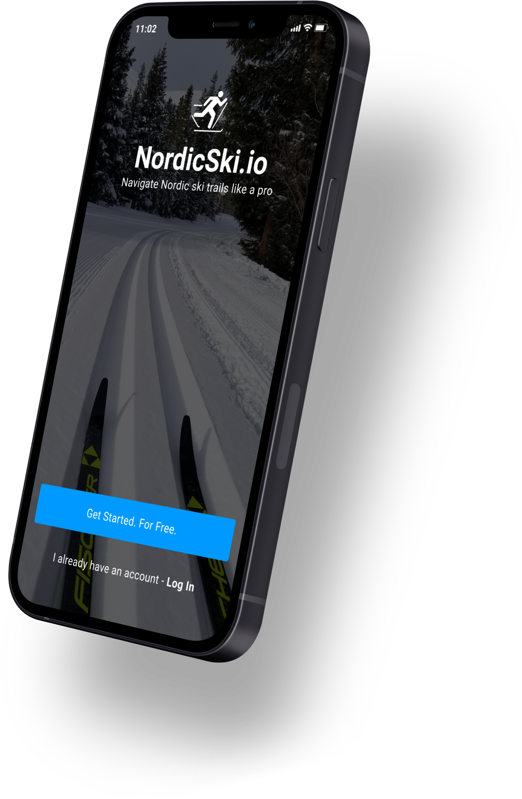
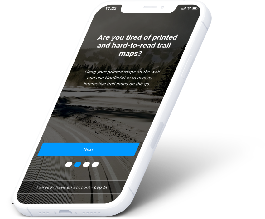
I set out to find whether the cross-country experience could be genuinely improved by software. That's how NordicSki.io was born: find Nordic ski centers, open trail maps with real GPS, check trail conditions, learn technique and waxing, and track your runs. No more printed maps.
02
How I got there
A survey of about 40 skiers, five long interviews, a competitive teardown of the apps they already used, then empathy maps and personas. The short version of a long process.
go skiing at least weekly during ski season
use apps on their phone at least 3 times a week
consider themselves expert skiers
go skiing with family and friends
The five insights that decided the product
- 01Very few skiers like printed maps, and they wish there was an alternative for navigating trails
- 02Predicting trail and snow conditions is very difficult
- 03It's easy to start skiing and hard to become a great skier
- 04Knowing which wax to use is a constant challenge
- 05There's no easy way for skiers to challenge each other virtually
The research, in artifacts

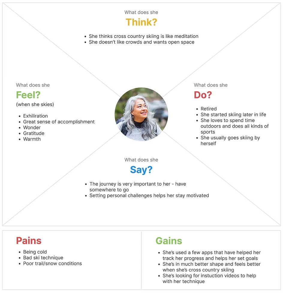
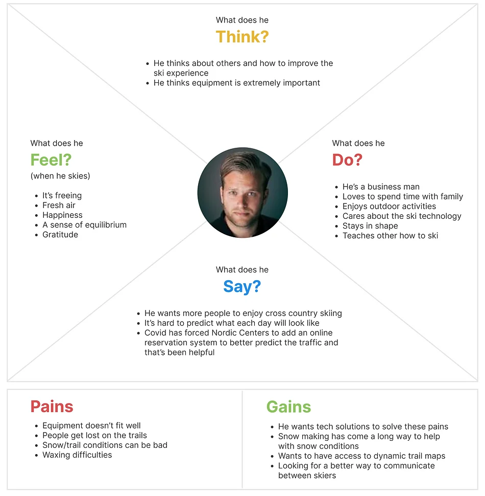
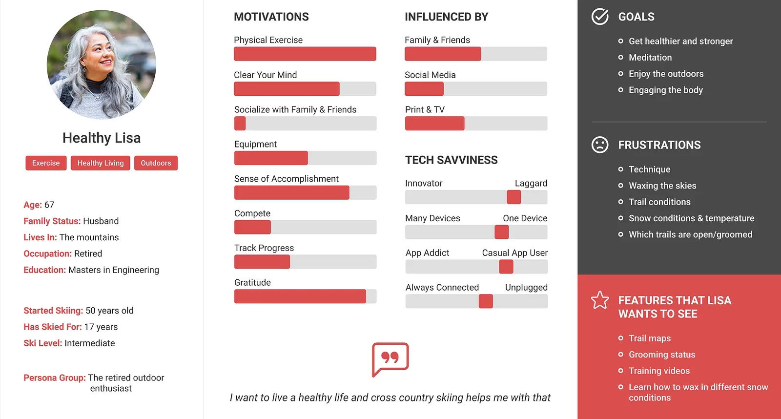
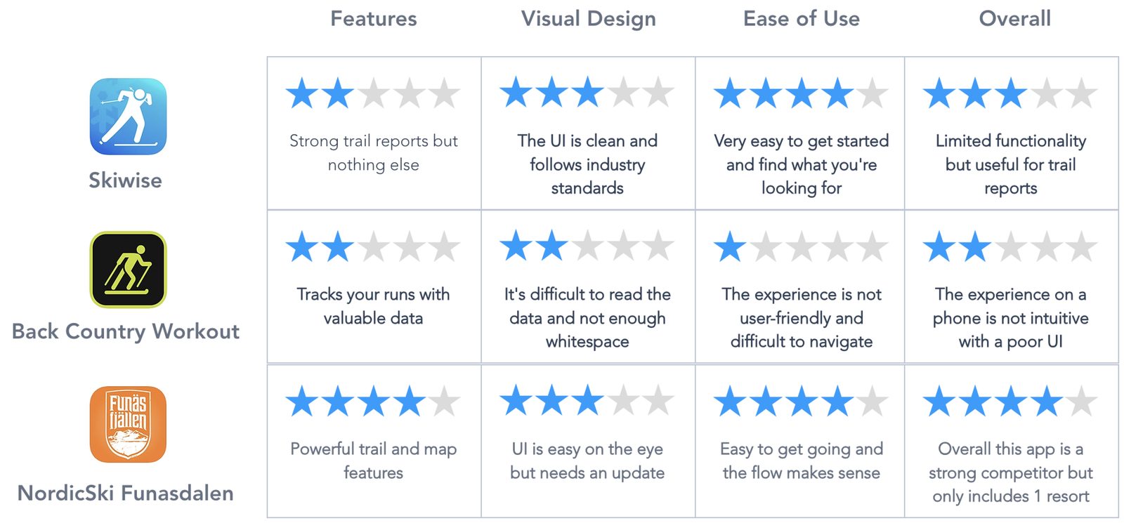
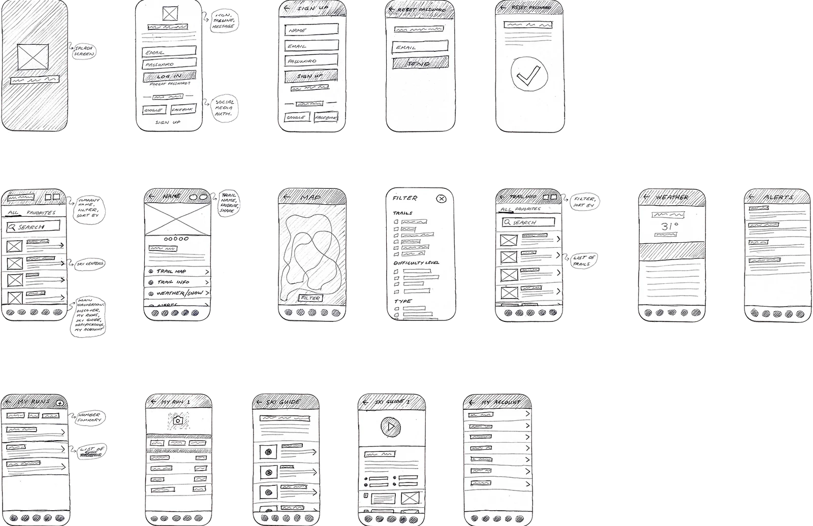
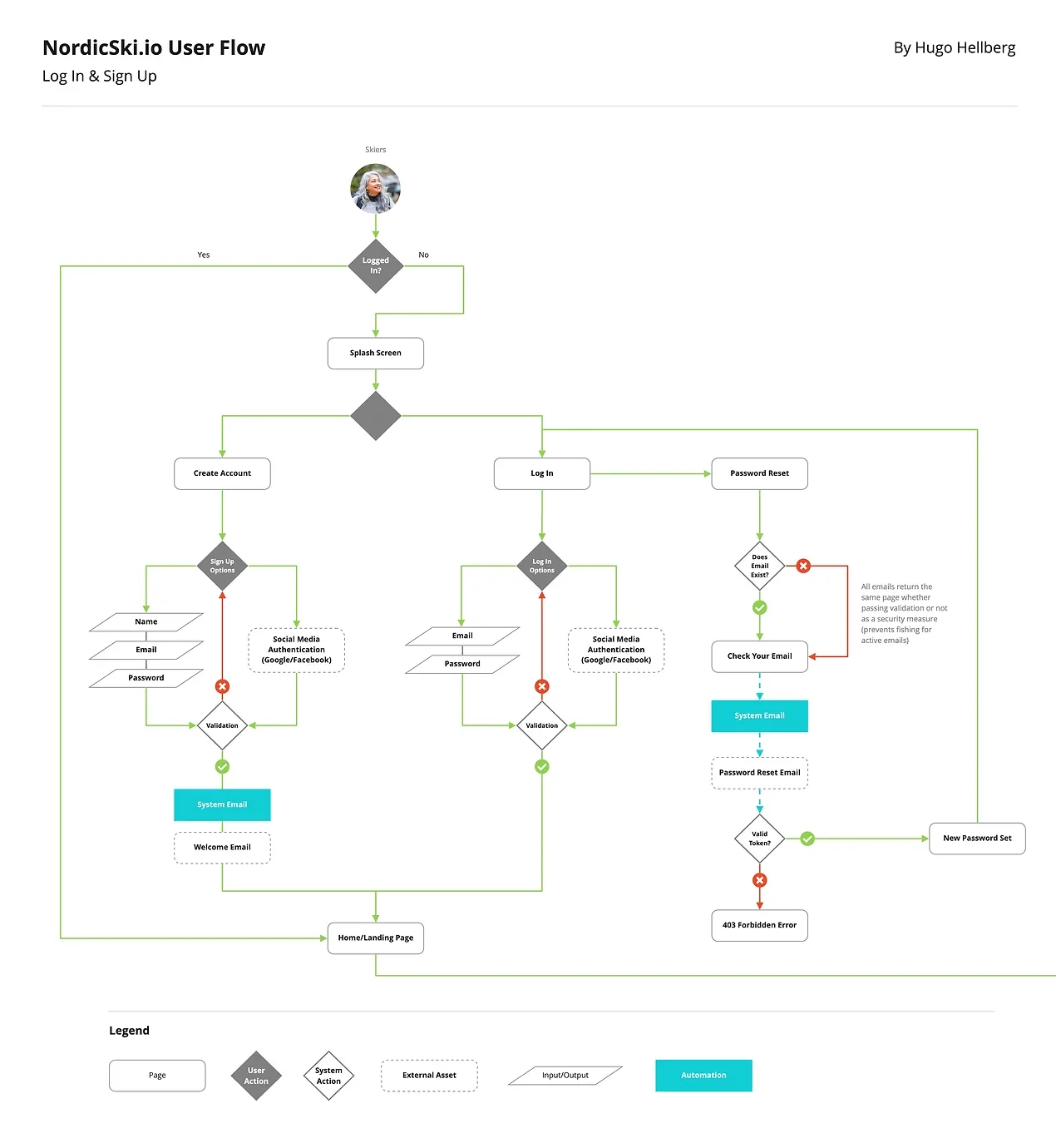
This was the traditional, long way round: desk research, a survey, interviews, affinity and empathy maps, personas, sketches, wireframes, a design system, two rounds of testing. I work faster now. But the thinking underneath hasn't changed.
03
The app
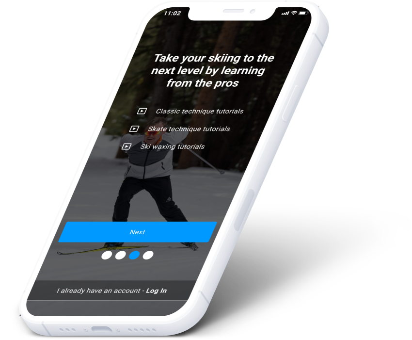
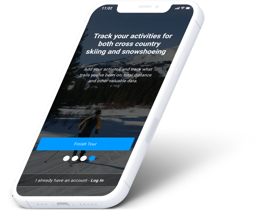
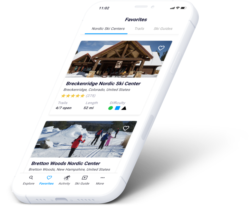
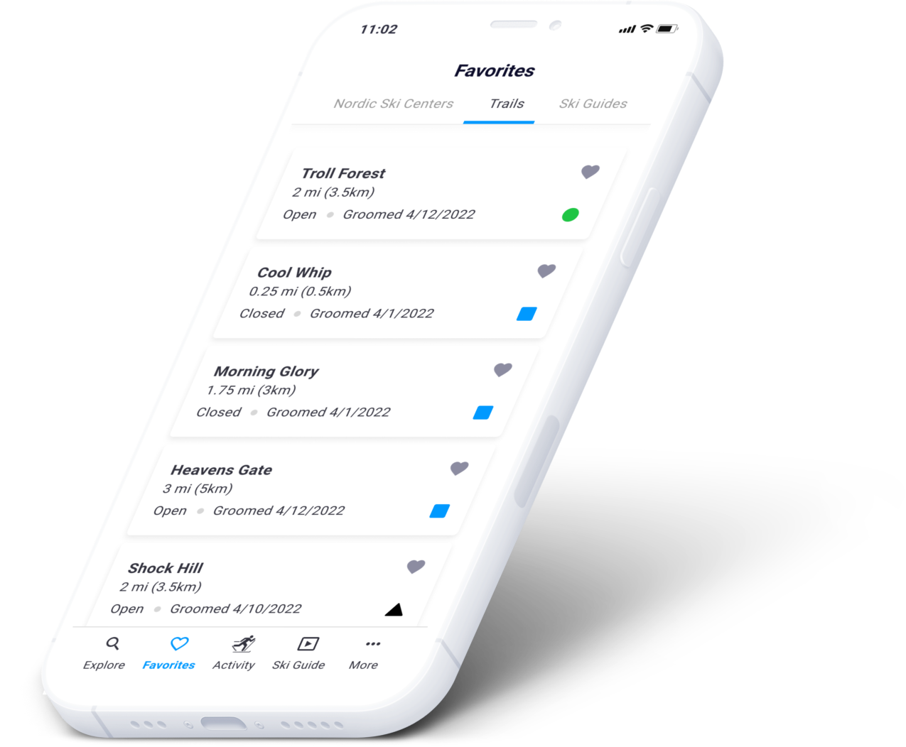
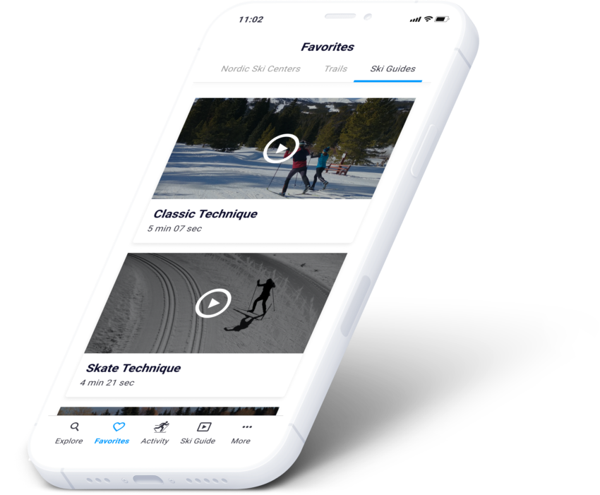
Find a ski center. Open the trail with live GPS. Check the conditions before you drive. Learn technique and waxing. Track the run with the trail detail attached.
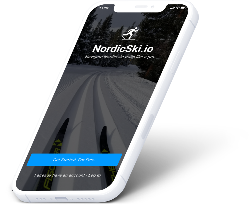
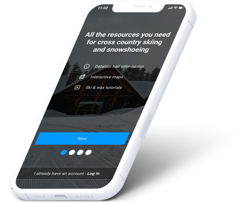
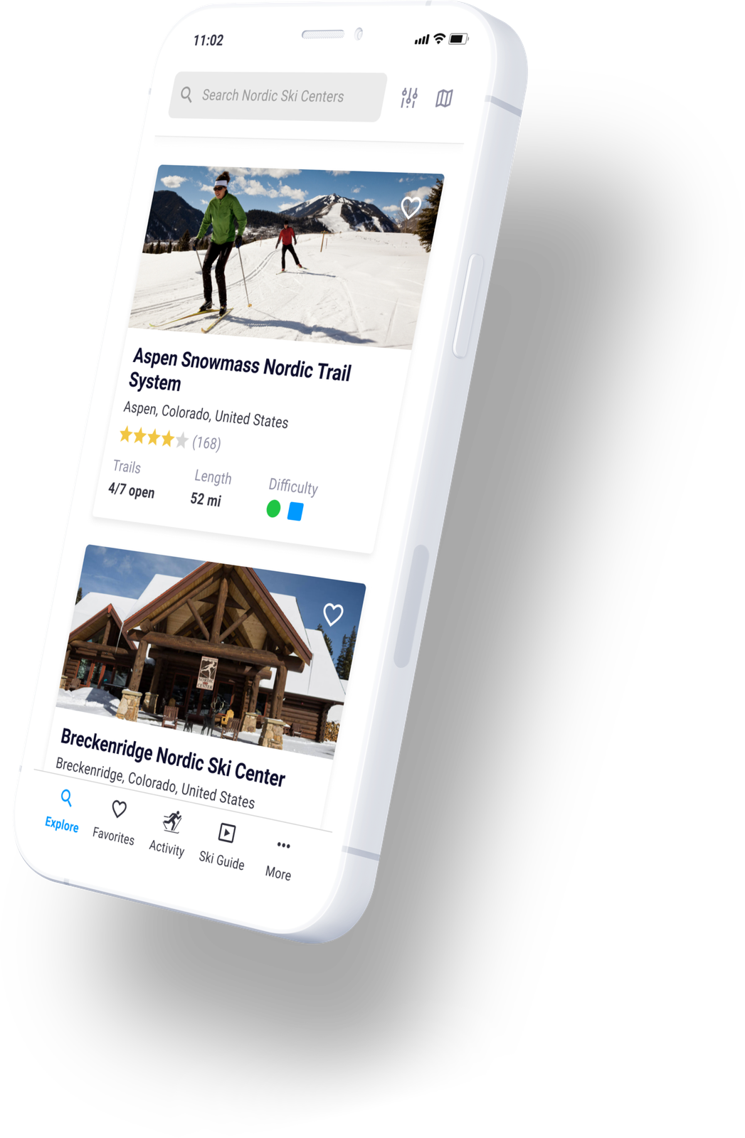
Explore Nordic ski centers
View live prototype ↗List view or map view of every center, with search and filters.
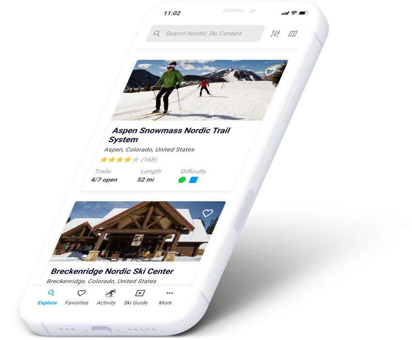
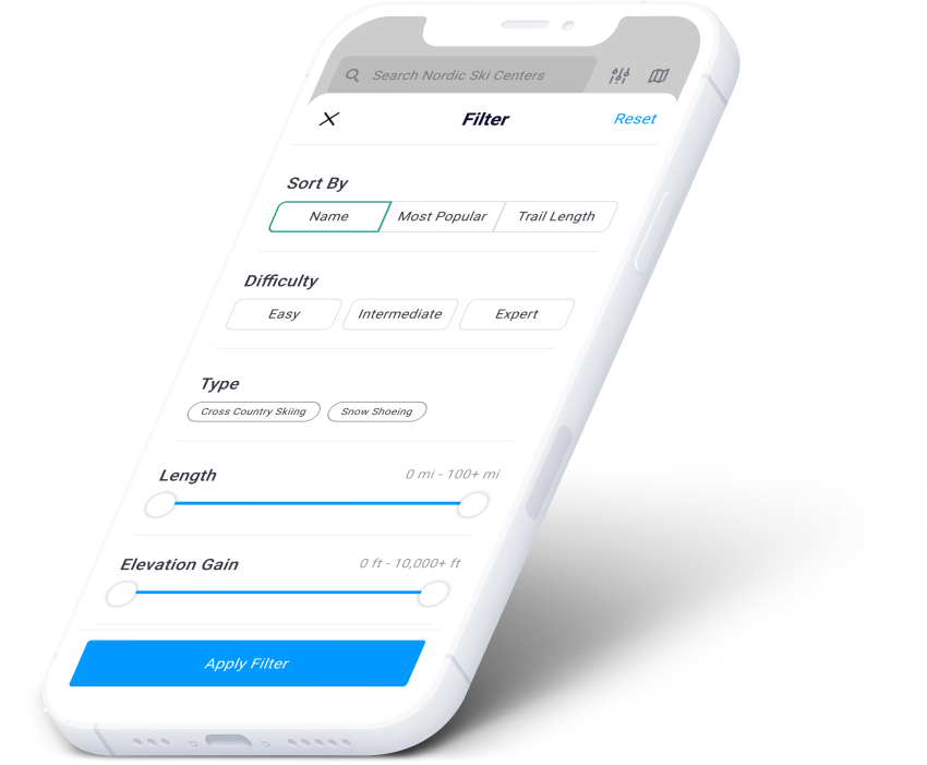
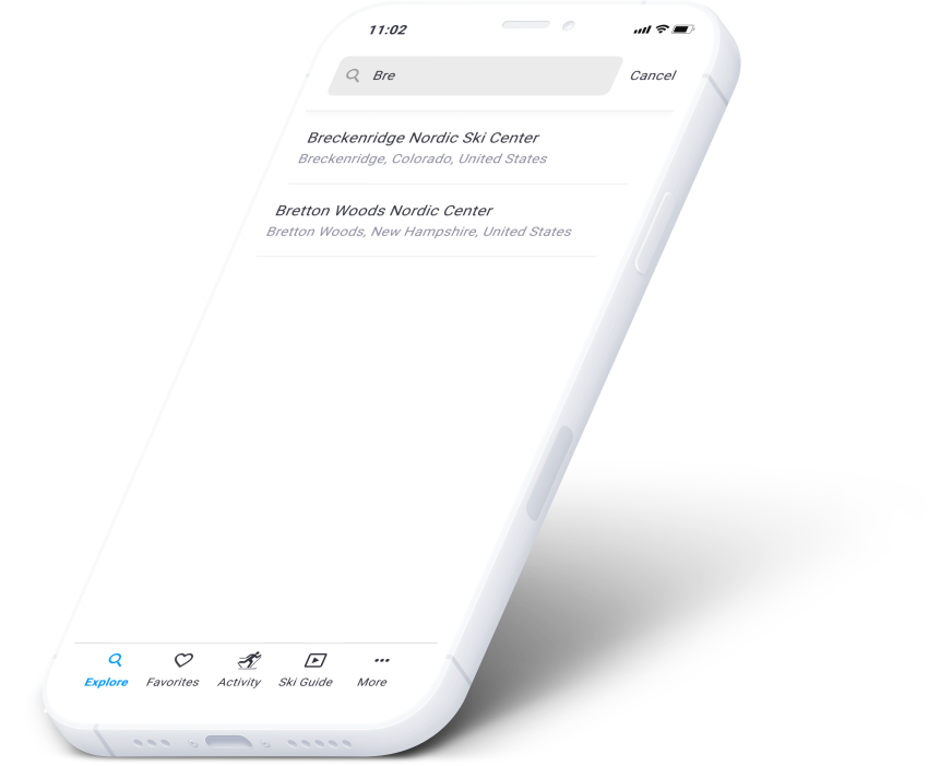
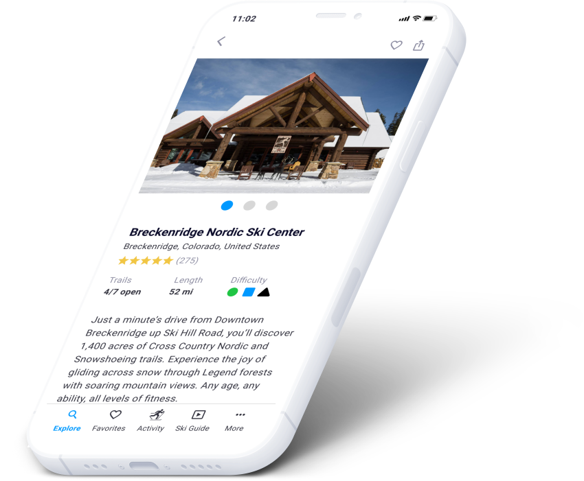
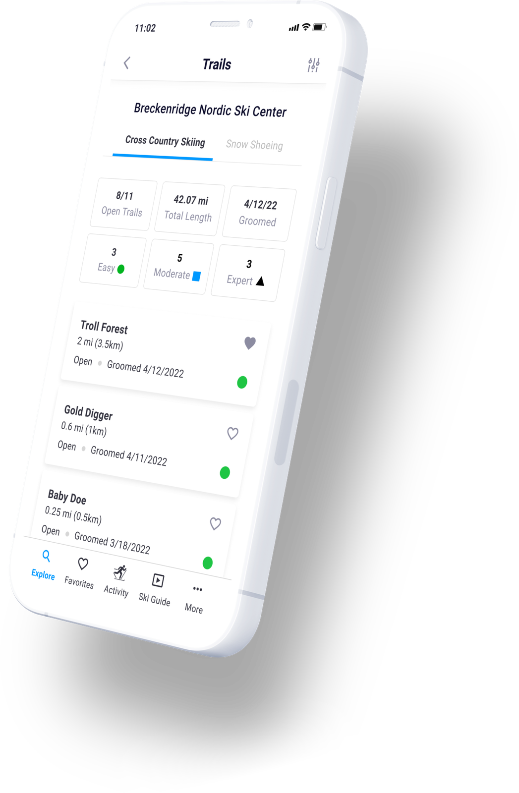
Explore ski trails
View live prototype ↗The same again for trails — the screen that replaces the printed map.
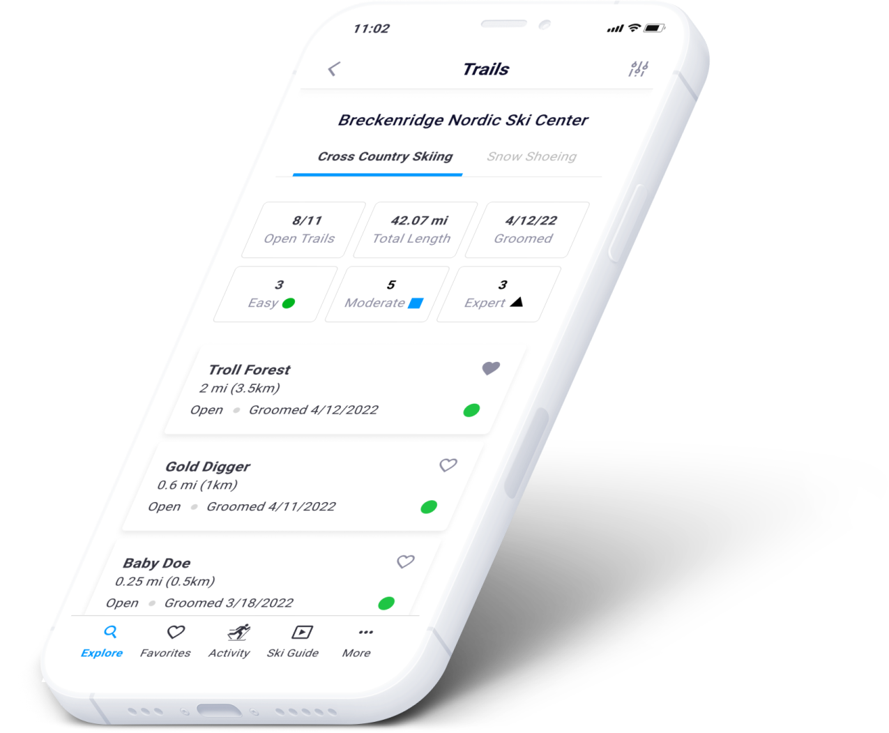
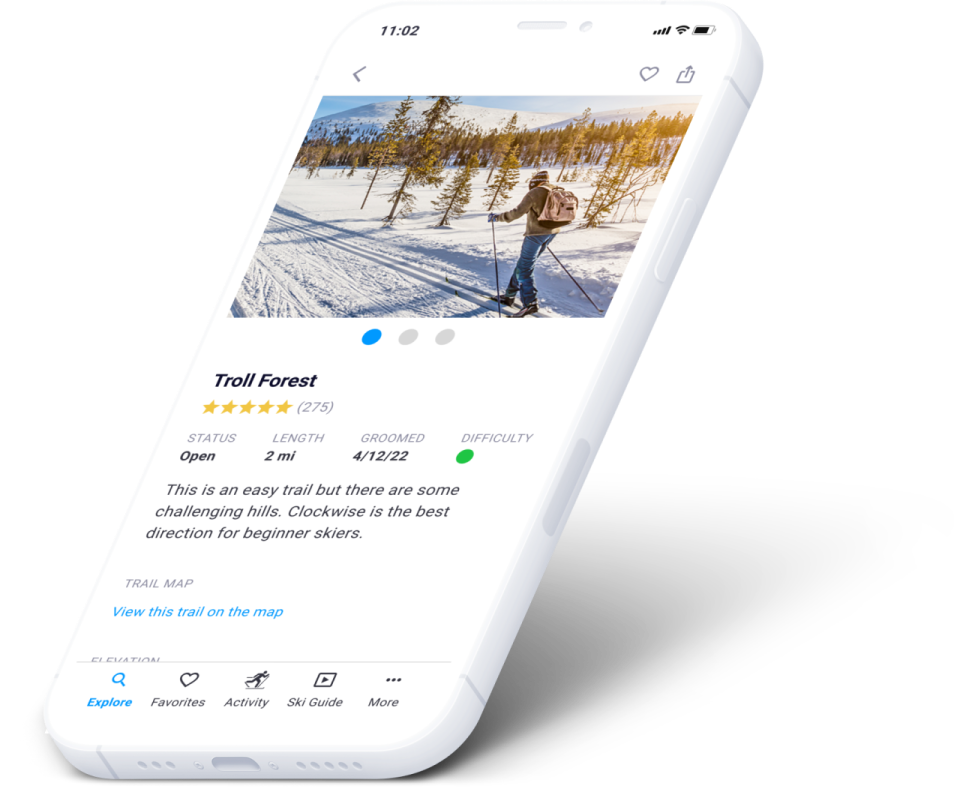
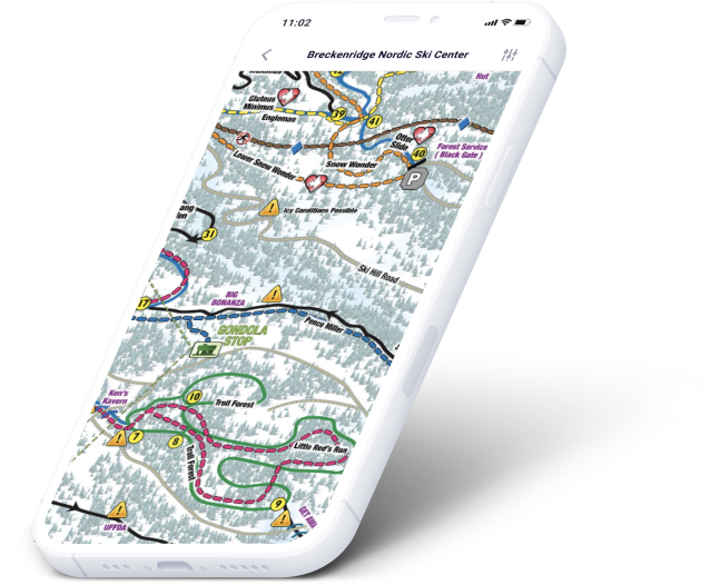
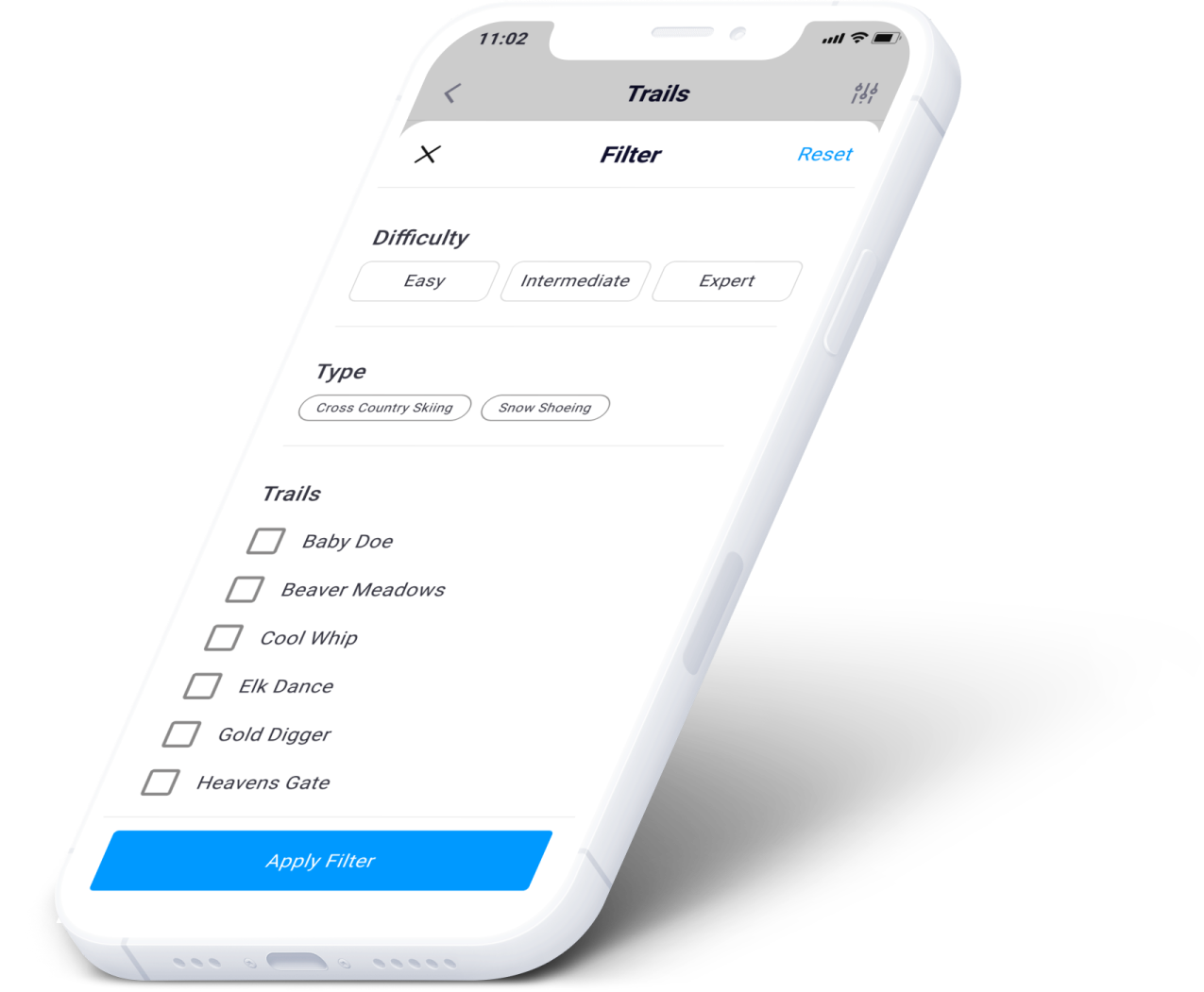
The system underneath
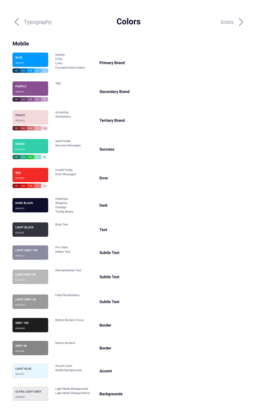
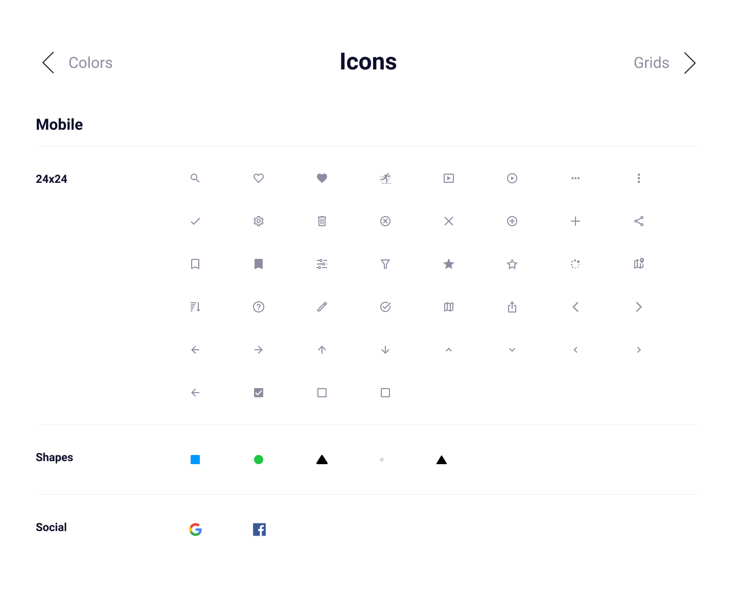
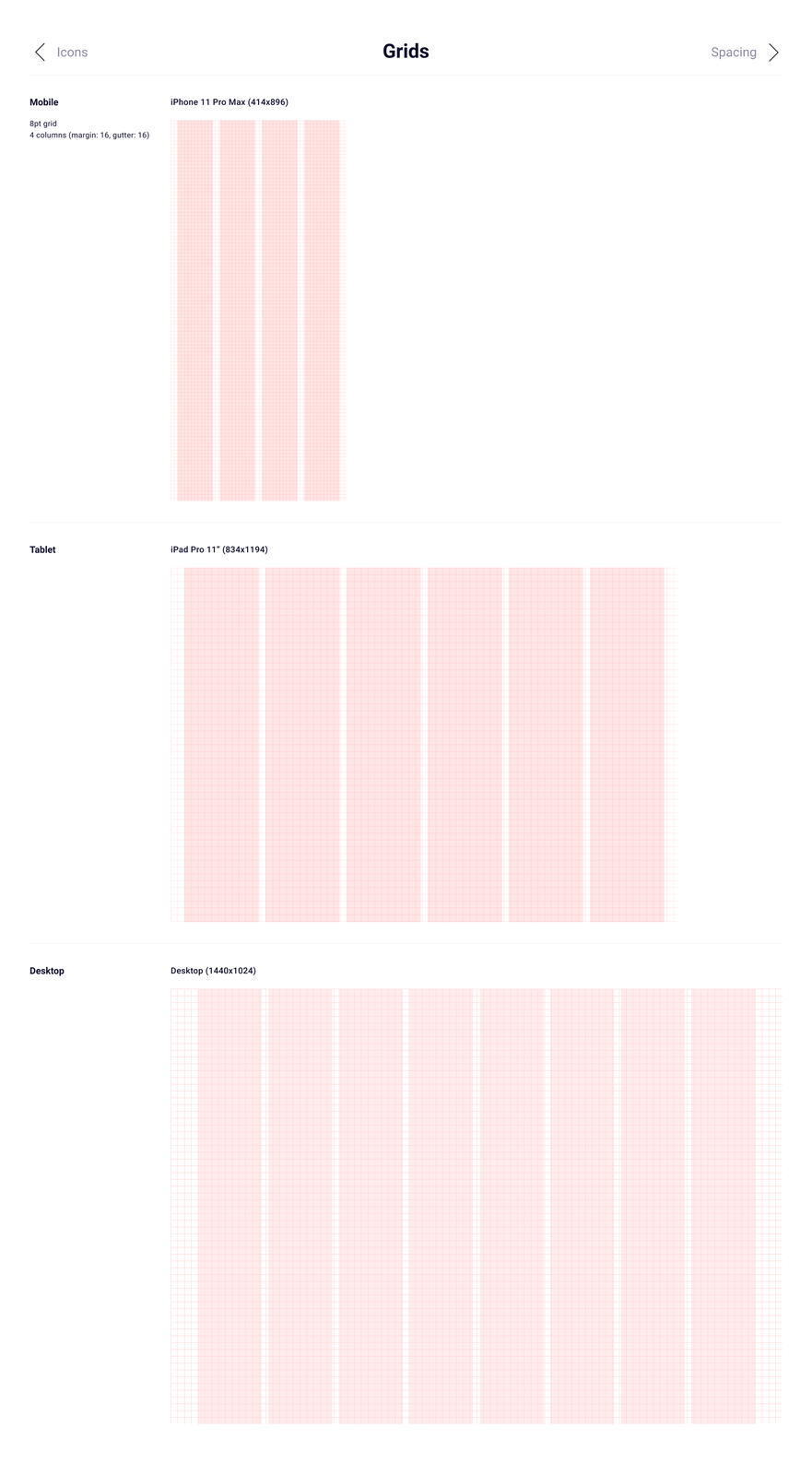
To keep the work moving I built a proper design system in Figma: a style guide of typography, colors, grids and icons, reusable components, and patterns where several components combine into something larger.

04
What testing changed
Two rounds of usability testing, five participants each. Per round: one in-person moderated, three remote moderated over Google Meet, one remote unmoderated in Maze. Thirty minutes a session.
The core flows worked
Finding a Nordic ski center or a trail was completed as expected by participants — the spine of the app held up.
People wanted the map sooner
Beyond the card view of ski centers, several users wanted map view immediately available, because it's faster for finding what's nearby.
Activity was too thin
For the MVP this module was basic, and testers doubted it offered enough to be worth using. Something to carry forward.
Wording, not layout
The UI drew positive comments for being easy to navigate. The friction was terminology — a few areas needed clearer words.
Which took us into a couple more rounds of iteration before the final design.
05
What I keep
Research is not a phase you get through. Every good decision in this app traces back to something a skier said out loud.
The final design is never final. This one is a snapshot between two rounds of testing and the next round of iteration.
Design for the sport, not the analogy. Cross-country skiers were being served by running apps — and the details are where the sport lives.