
Skiwise
- Features
Strong trail reports but nothing else
- Visual Design
The UI is clean and follows industry standards
- Ease of Use
Very easy to get started and find what you're looking for
- Overall
Limited functionality but useful for trail reports
Case study
Navigate Nordic ski trails like a pro.
Cross-country skiers still navigate with printed maps that get wet, ripped, and can't tell you where you are. NordicSki.io was my answer: a full design cycle, from first interview to tested prototype, for a sport the software industry had quietly skipped.
Industry · Challenge · Opportunity · My role
I've been a cross-country skier my whole life. It's one of the oldest winter sports and one of the best cardiovascular workouts there is — its popularity comes from how simple and healthy it is. A pair of skis, poles, snow, and off you go. It's been growing in the US, and the people I interviewed described it as peaceful, exhilarating and adventurous.
To navigate most ski trails you need a printed map. It's impossible to know exactly where you are on one. Every time you want to check it you have to unfold it, so it gets wet and ripped. And to track their runs, skiers rely on apps built for running, hiking and biking — apps that never give them the trail detail that actually matters.
I set out to find whether the cross-country experience could be genuinely improved by software. That's how NordicSki.io was born: find Nordic ski centers, open trail maps with real GPS, check trail conditions, learn technique and waxing, and track your runs. No more printed maps.
I led the project as the sole UX researcher and designer — conducting and analyzing the research, building personas, user flows and wireframes, then designing a high-fidelity prototype and testing it with real skiers.
Tools — Figma, Miro, Maze, Optimal Workshop, Milanote and UXPressia
Stakeholders were in it from the very beginning — including engineering. Less friction during the work, and a far easier handoff at the end.
Quantitative research · Competitive analysis · Survey · Interviews
I started wide: desk research to understand the shape of the industry before talking to anyone in it.
Why do people cross-country ski?
One of the oldest winter sports and one of the best cardiovascular exercises there is. Its popularity comes from its simplicity and healthiness.
Who goes cross-country skiing?
Extremely popular in Norway, Canada, Germany, Sweden, Finland and Russia — and growing in the US.
Skiers by gender in the US
I identified the apps skiers actually use. Plenty of apps track a ski run well, but they're built for runners, hikers and cyclists. For this analysis I only included apps with cross-country skiers as their primary audience.
| Competitor | Features | Visual Design | Ease of Use | Overall |
|---|---|---|---|---|
| Skiwise | Strong trail reports but nothing else | The UI is clean and follows industry standards | Very easy to get started and find what you're looking for | Limited functionality but useful for trail reports |
 Back Country Workout Back Country Workout | Tracks your runs with valuable data | It's difficult to read the data and not enough whitespace | The experience is not user-friendly and difficult to navigate | The experience on a phone is not intuitive with a poor UI |
 NordicSki Funasdalen NordicSki Funasdalen | Powerful trail and map features | UI is easy on the eye but needs an update | Easy to get going and the flow makes sense | Overall this app is a strong competitor but only includes 1 resort |
Strong trail reports but nothing else
The UI is clean and follows industry standards
Very easy to get started and find what you're looking for
Limited functionality but useful for trail reports
Tracks your runs with valuable data
It's difficult to read the data and not enough whitespace
The experience is not user-friendly and difficult to navigate
The experience on a phone is not intuitive with a poor UI
Powerful trail and map features
UI is easy on the eye but needs an update
Easy to get going and the flow makes sense
Overall this app is a strong competitor but only includes 1 resort
Heuristics I judged them against
| Competitor | Visibility of System Status | Consistency and Standards | Aesthetic and minimalist design |
|---|---|---|---|
| Skiwise | Negative: No back/cancel button on many pages which makes it hard to know where you are in the app. | Positive: The terminology is consistent across the app and the navigation follows the industry standard. | Positive: The UI offers ample whitespace with limited distractions. Negative: Every feature is hidden which has a negative effect on the experience. |
| Back Country Workout | Negative: The phone app doesn't make it clear that you need a smart watch to start a session. | Negative: It doesn't follow the industry standards when it comes to navigation and actions are unclear. | Negative: The first impression sets the tone for a bad experience. The content is too busy. |
| NordicSki Funasdalen | Positive: Keeps the user informed through appropriate messages on each page. | Negative: There are a few inconsistencies with navigation actions and placement. | Positive: In some ways it looks a bit outdated but overall the aesthetics is pleasant with a decent design. |
Negative: No back/cancel button on many pages which makes it hard to know where you are in the app.
Positive: The terminology is consistent across the app and the navigation follows the industry standard.
Positive: The UI offers ample whitespace with limited distractions.
Negative: Every feature is hidden which has a negative effect on the experience.
Negative: The phone app doesn't make it clear that you need a smart watch to start a session.
Negative: It doesn't follow the industry standards when it comes to navigation and actions are unclear.
Negative: The first impression sets the tone for a bad experience. The content is too busy.
Positive: Keeps the user informed through appropriate messages on each page.
Negative: There are a few inconsistencies with navigation actions and placement.
Positive: In some ways it looks a bit outdated but overall the aesthetics is pleasant with a decent design.
Then the part that changed everything: a survey and in-person interviews about how skiing actually feels, and what people are already doing with their phones on the trail.
Survey — ~40 responses
Check out the survey ↗go skiing at least weekly during ski season
use apps on their phone at least 3 times a week
consider themselves expert skiers
go skiing with family and friends
The screener survey gave me the five most suitable candidates, chosen for range rather than convenience. Each session ran about 30 minutes over Google Meet, to a script and a strict timeline. Three participants let me record.

Affinity map · Empathy maps · Personas · How might we
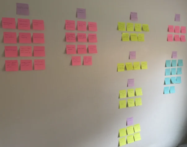
I sorted every comment from the interviews into four categories: feelings, challenges and pain points, existing tech solutions, and existing features.
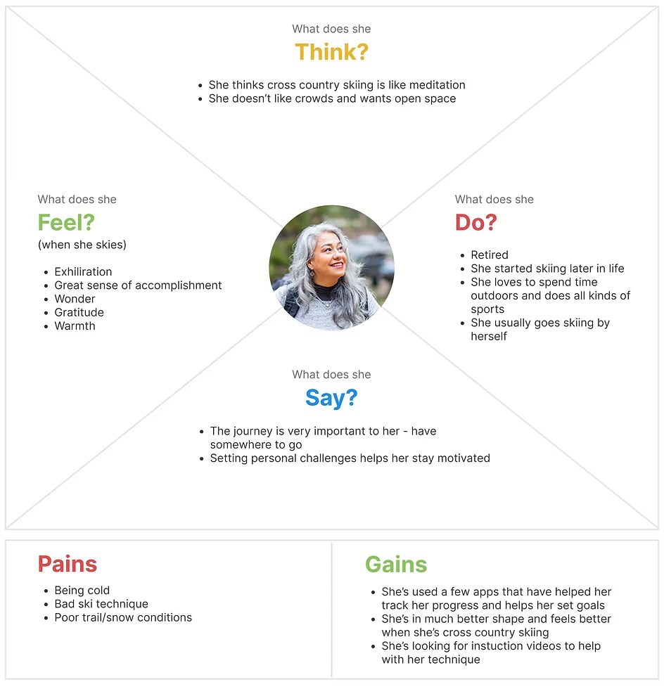
Everything I'd learned went into two empathy maps — what these skiers say, think, feel and do, plus their pains and gains.
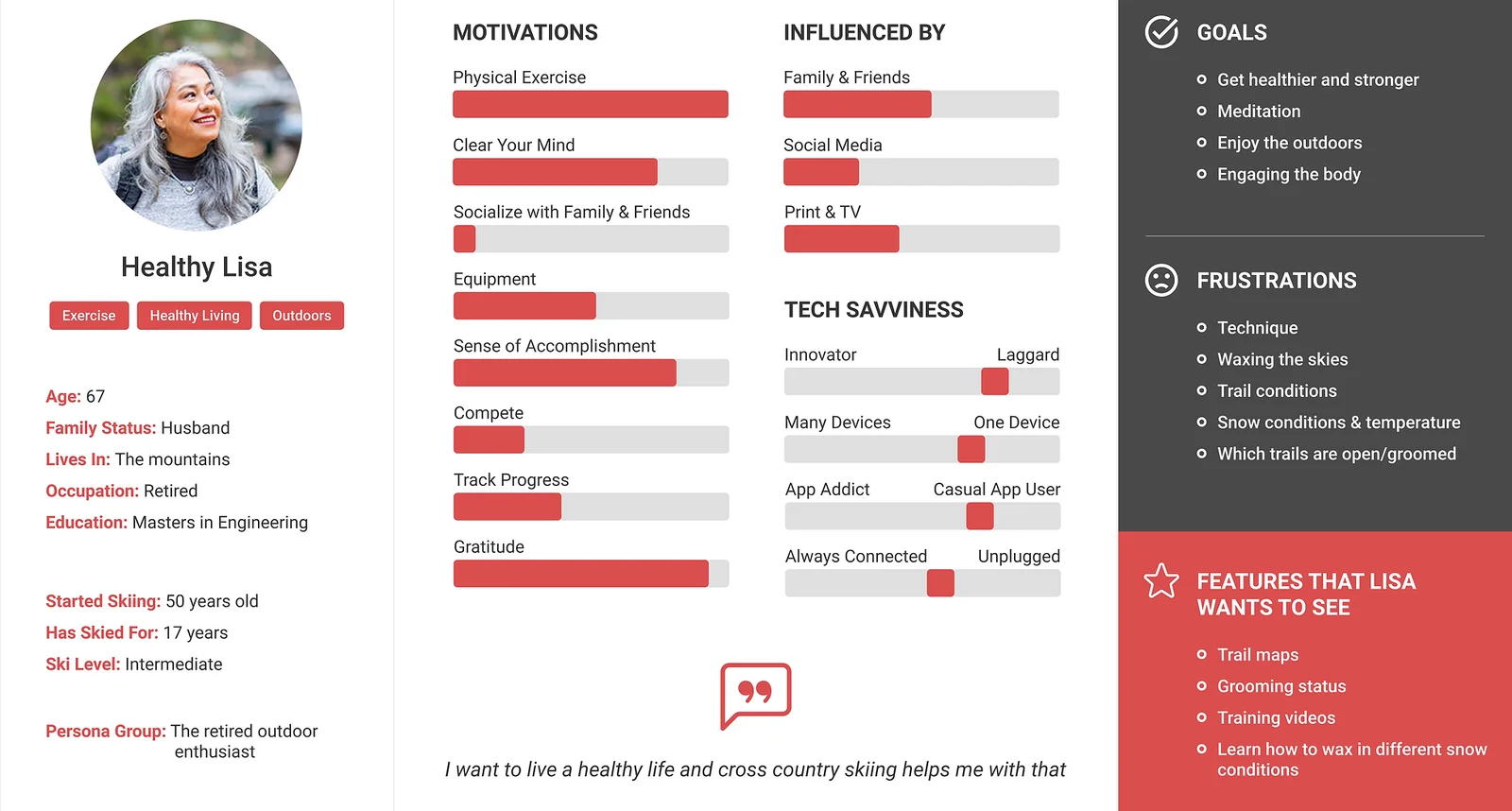
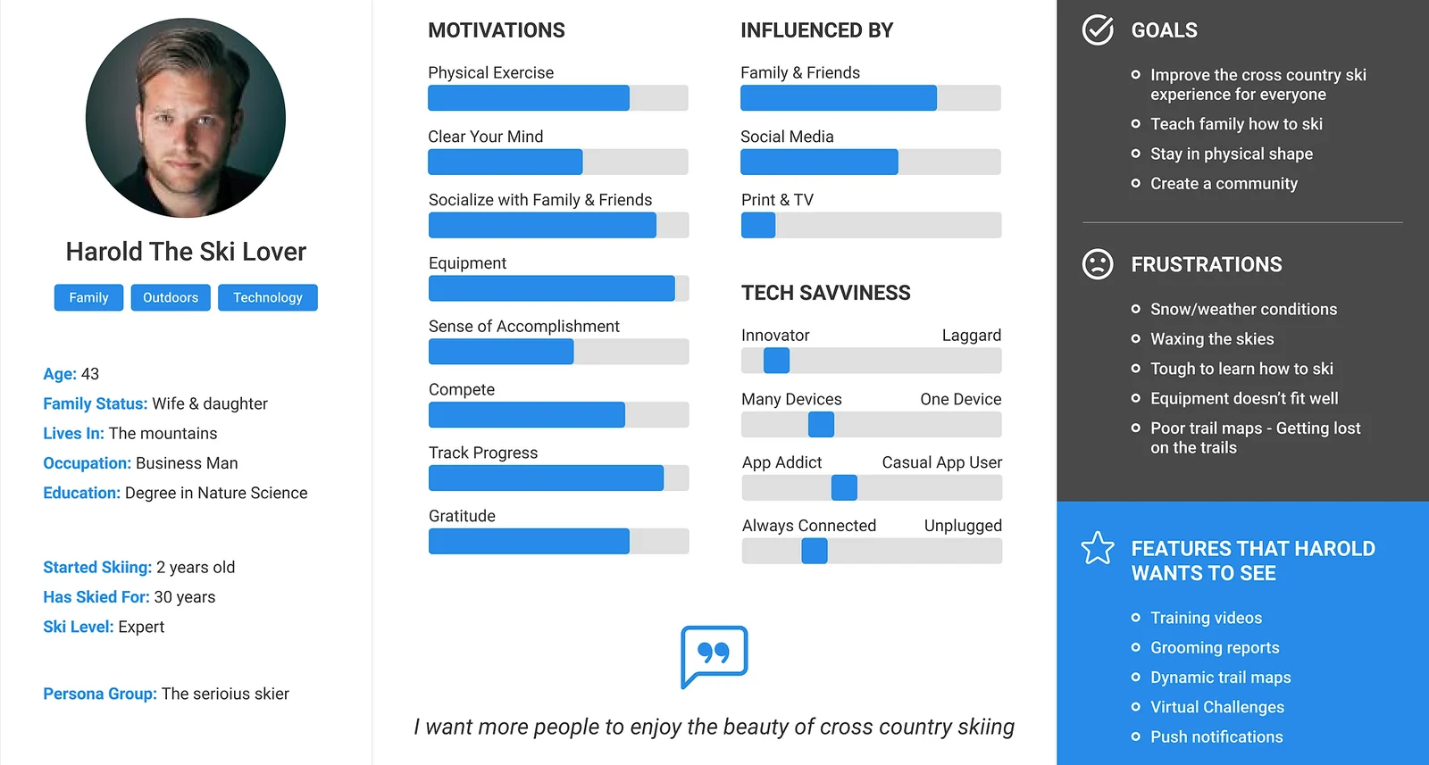
From the empathy maps came two personas that represented the majority of interviewees and survey respondents.
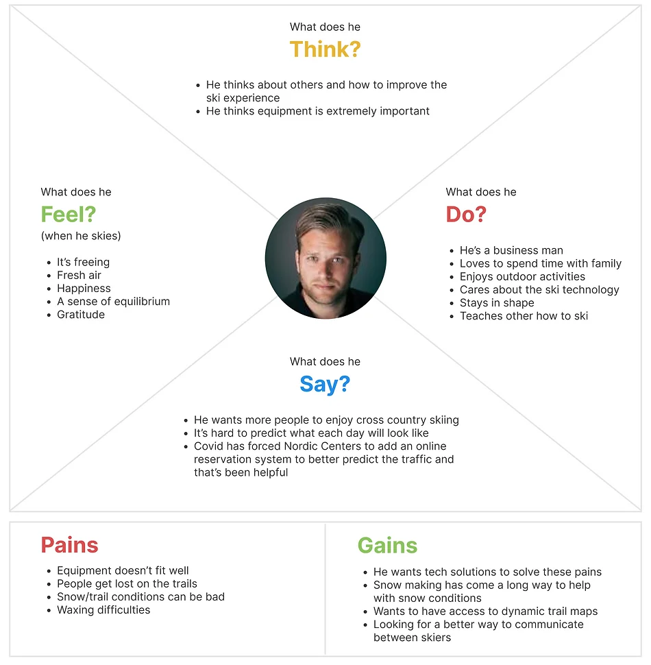
There was a clear opportunity to improve this experience — but only if we partnered with Nordic ski centers to reach the audience. Five insights carried into ideation.
Brainstorming · Sketching · User stories · User flow
Pen to paper. Every idea the insights and how-might-we questions suggested, sketched fast and judged later.
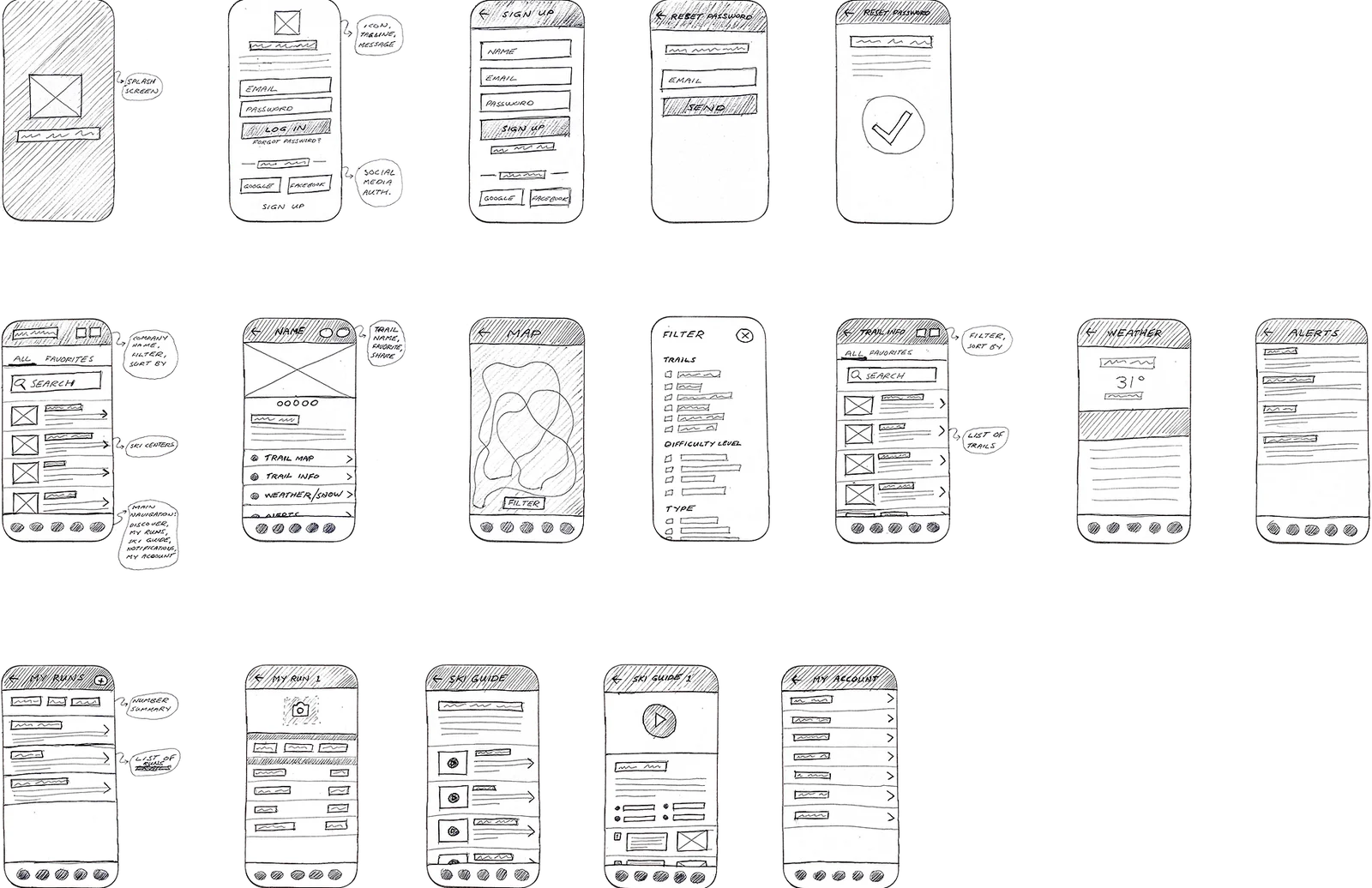
Short user stories kept the feature list honest about whose problem it solved.
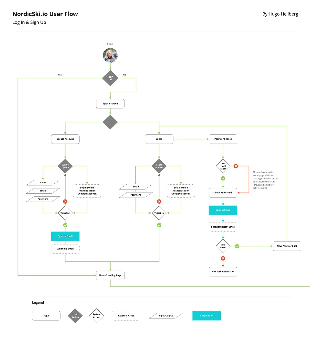
A user flow mapped the red routes: find a ski center, explore trails, add an activity, watch a tutorial.
Wireframes · Design system · LoFi · HiFi
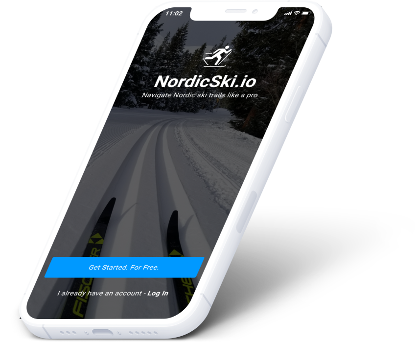
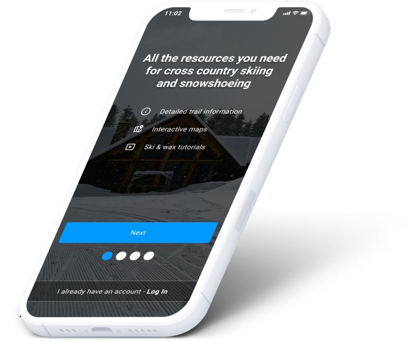
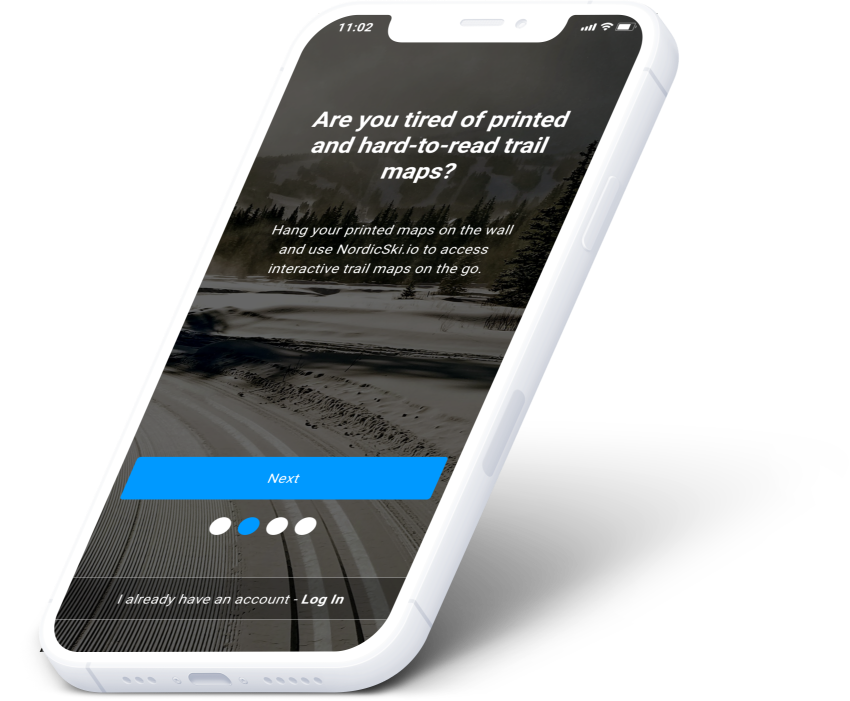
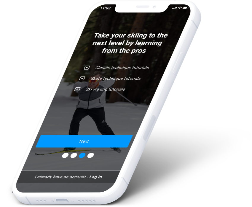
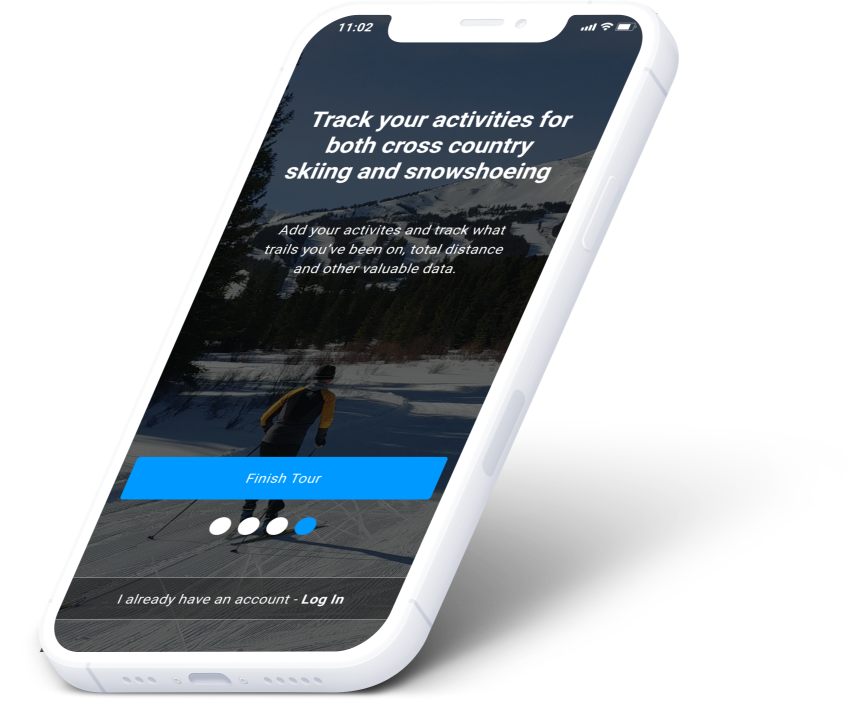
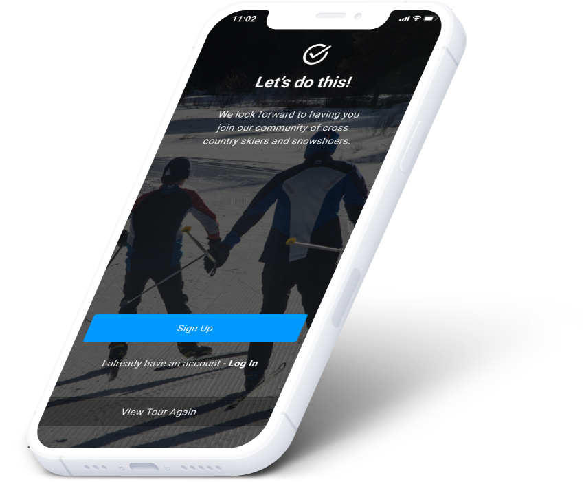
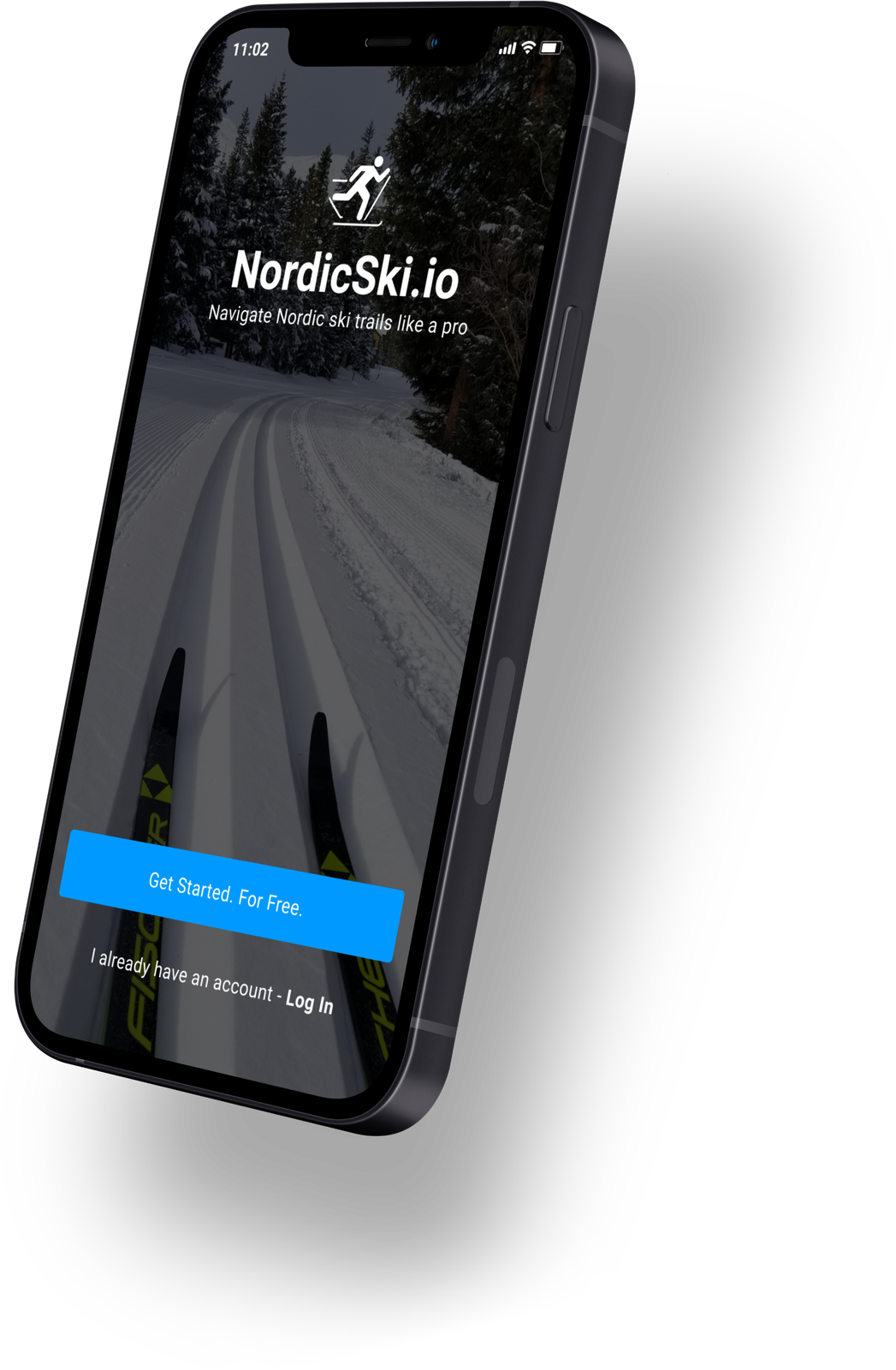
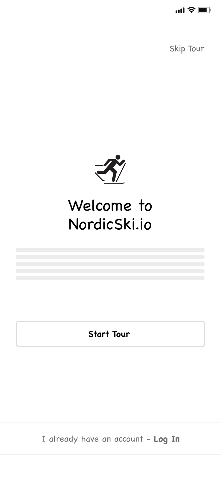
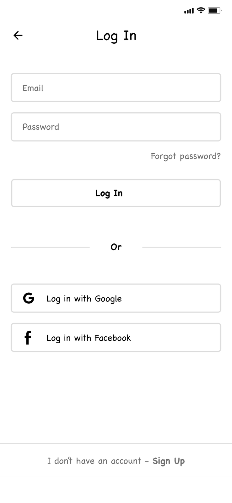
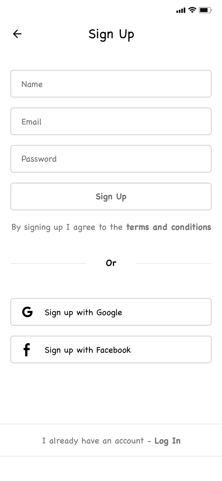
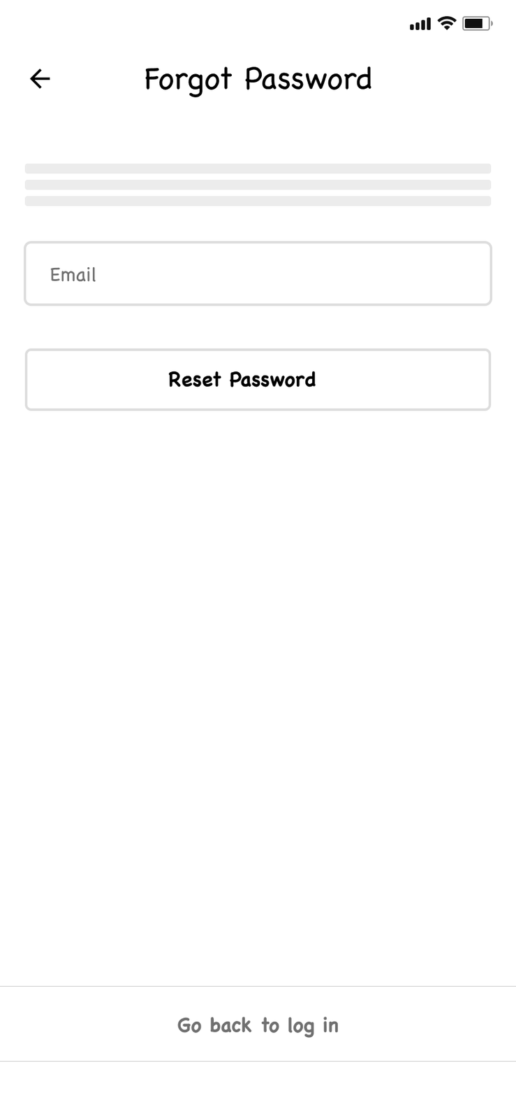
A welcome screen that lets people take the tour — or skip straight to logging in.
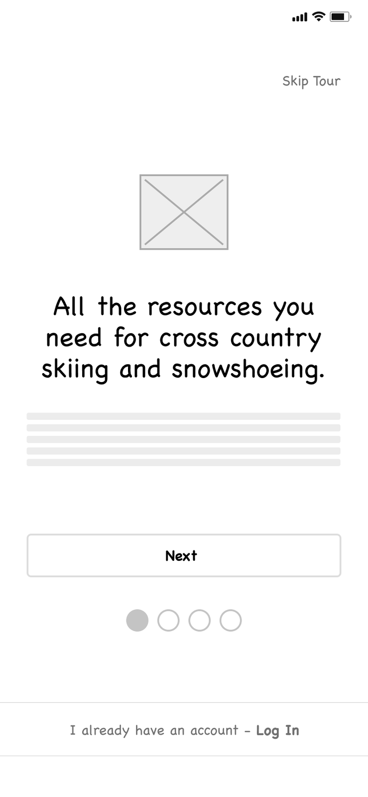
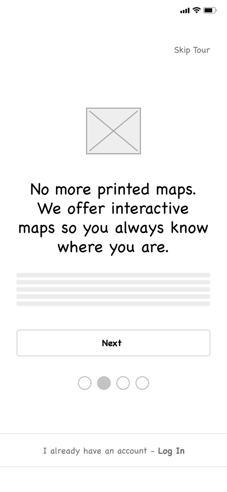
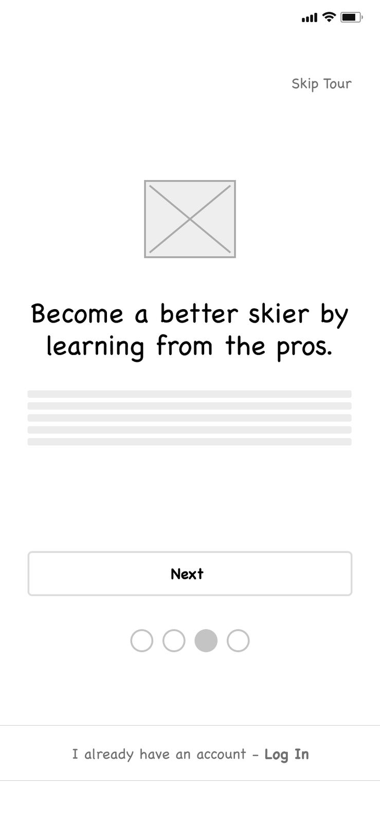
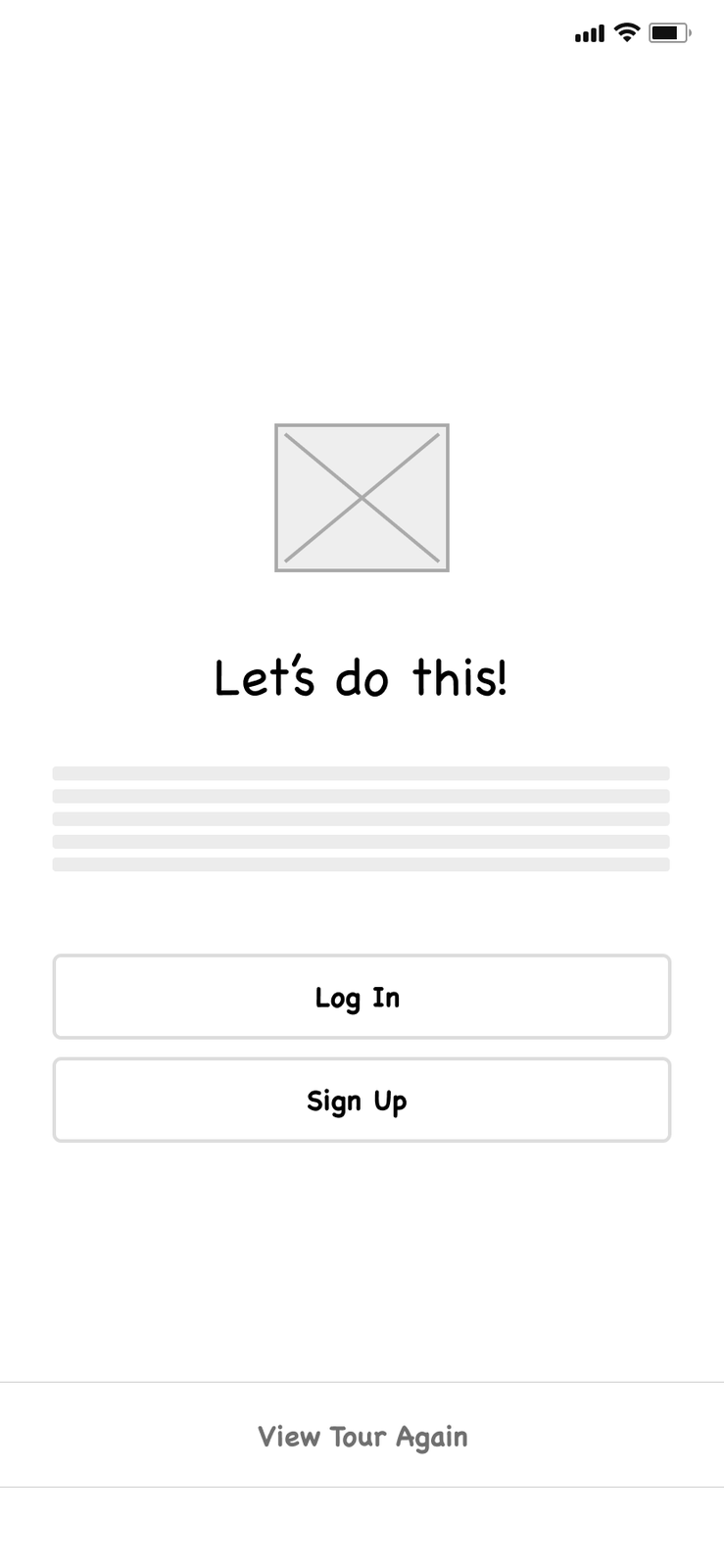
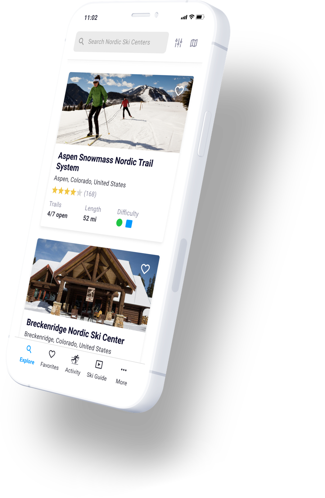
Finding Nordic ski centers and trails had to be the fastest thing in the app.
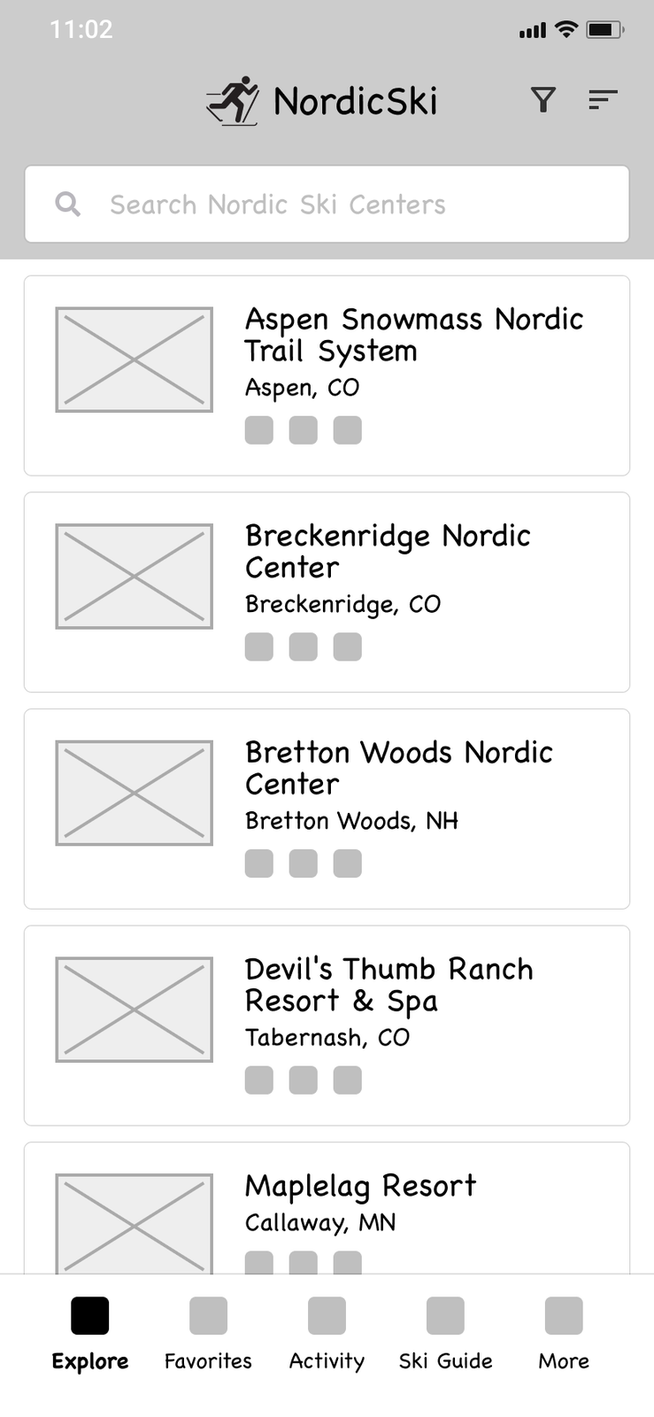
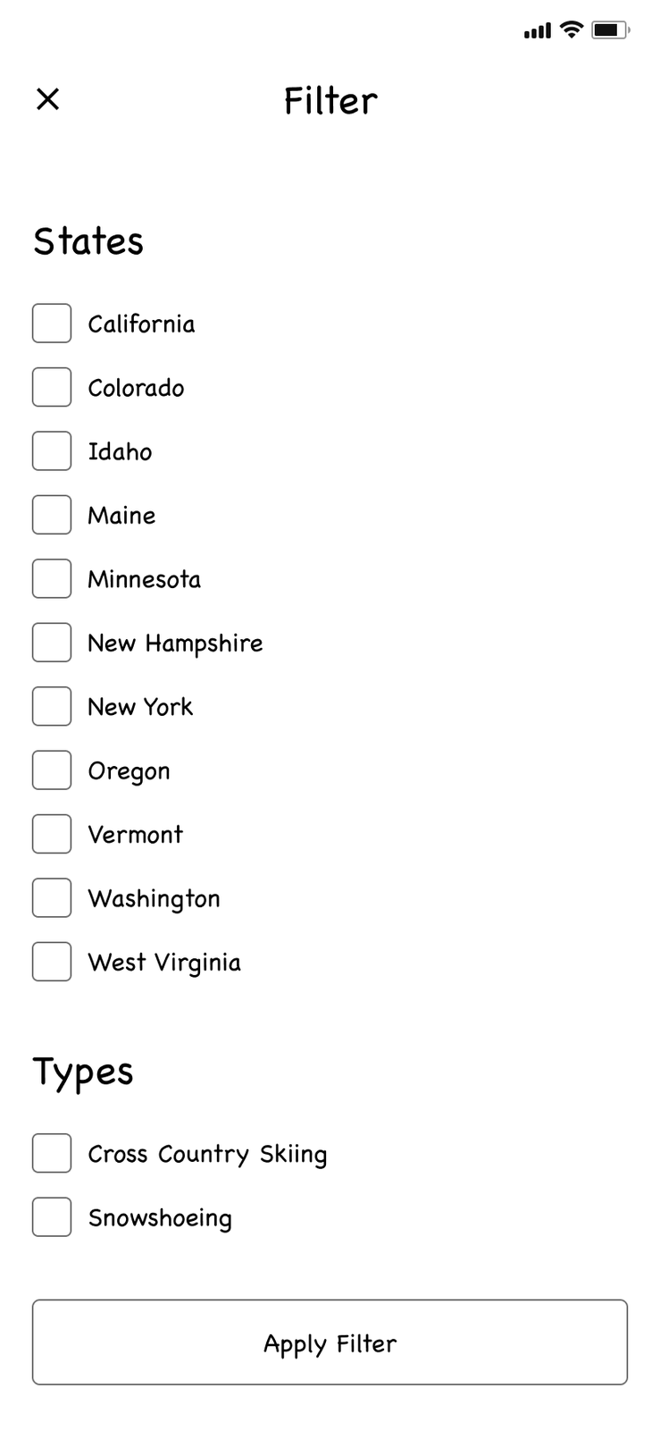
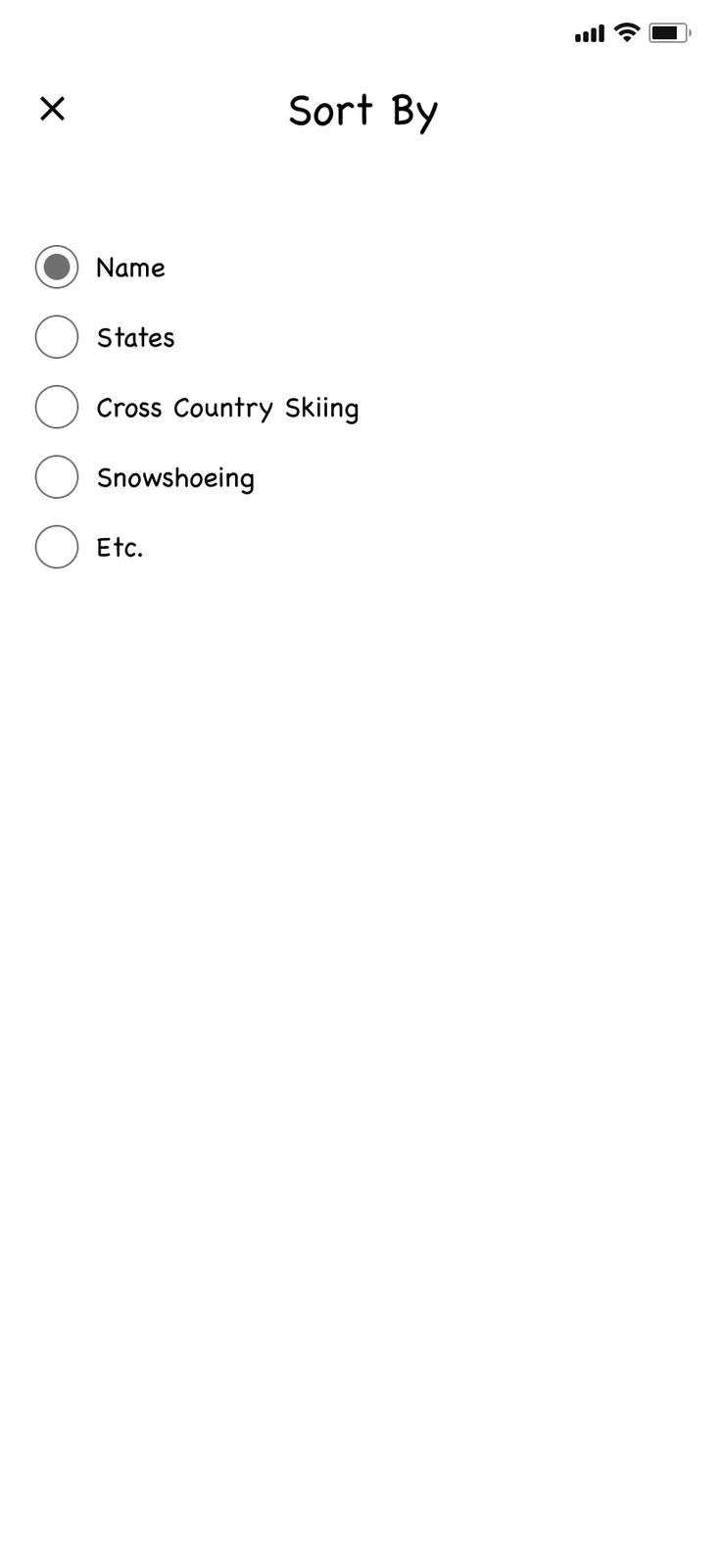
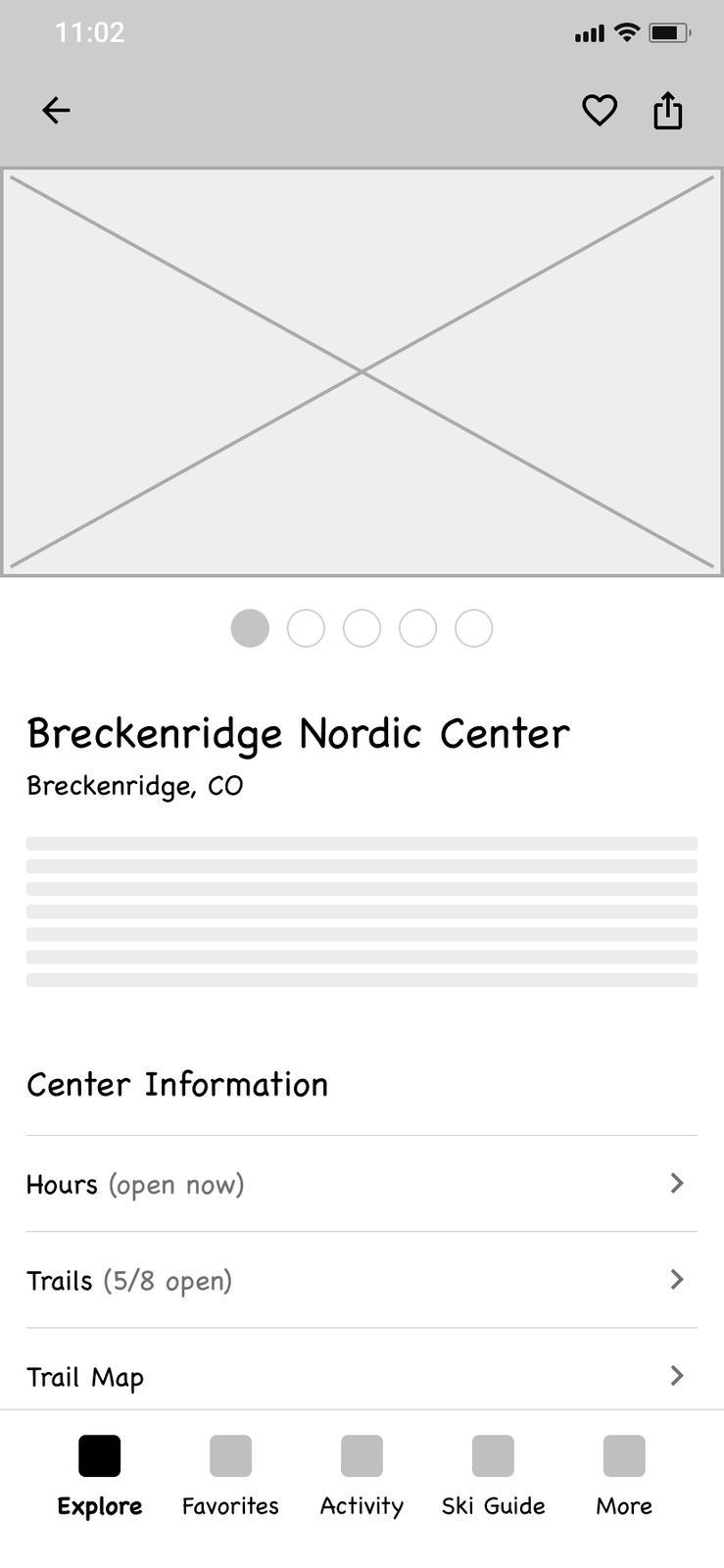
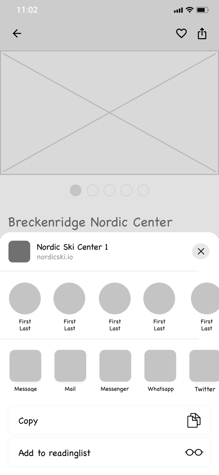
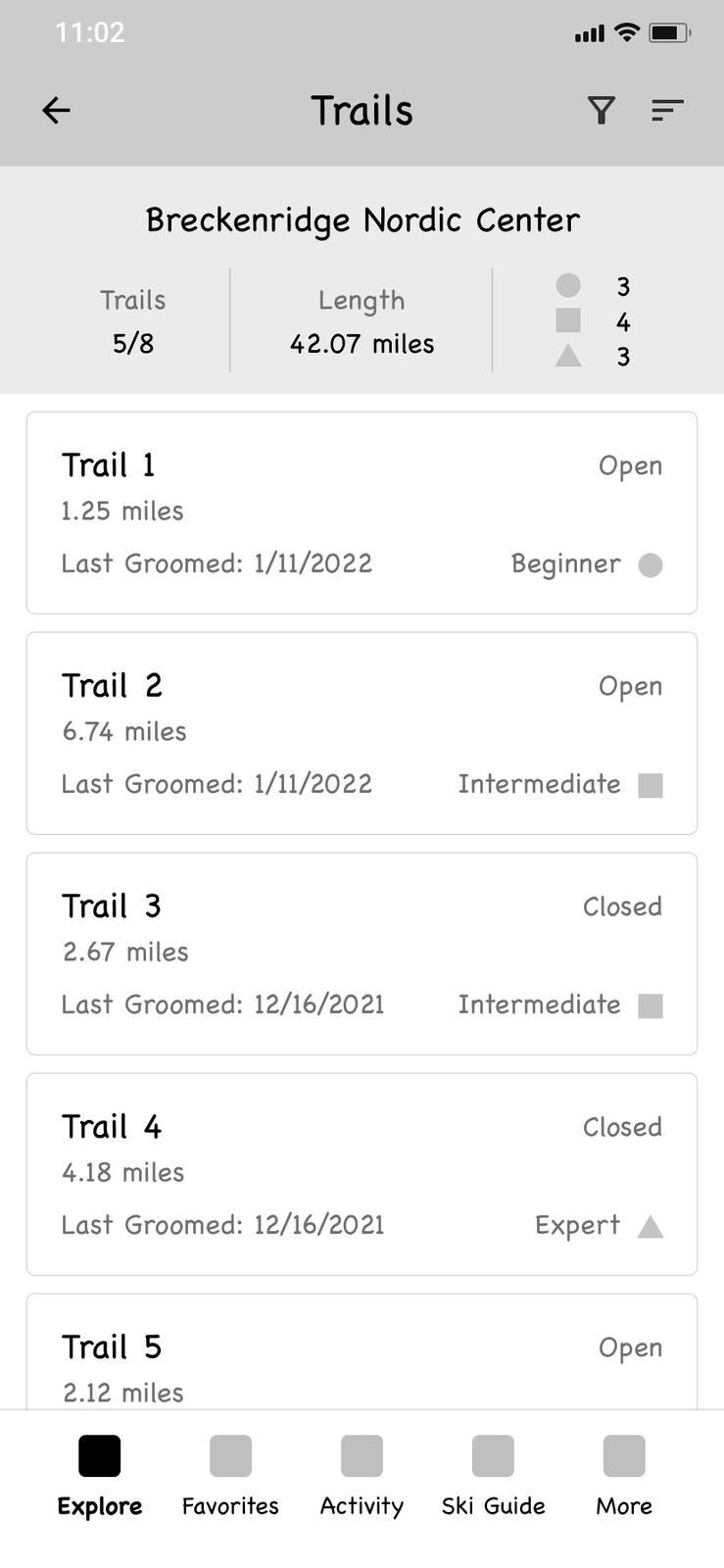
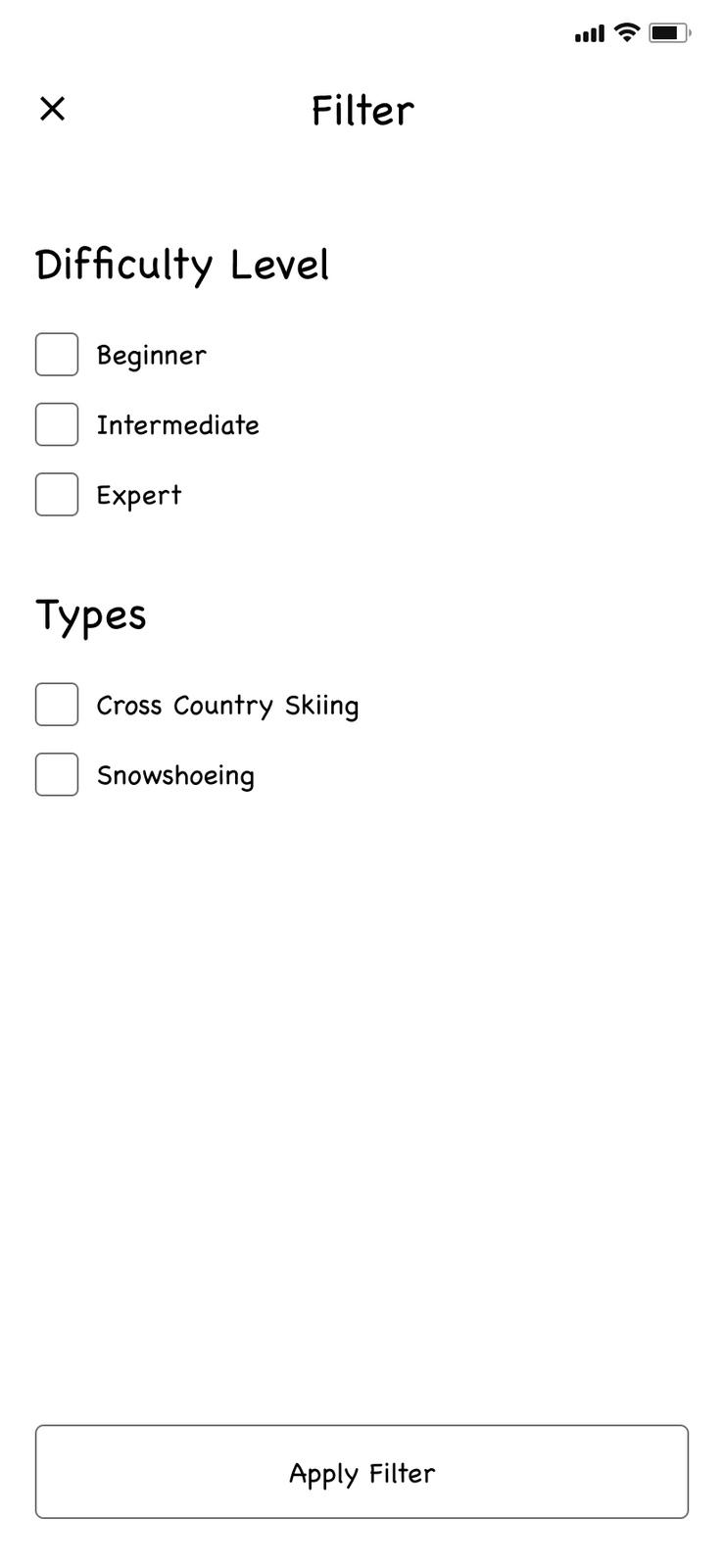
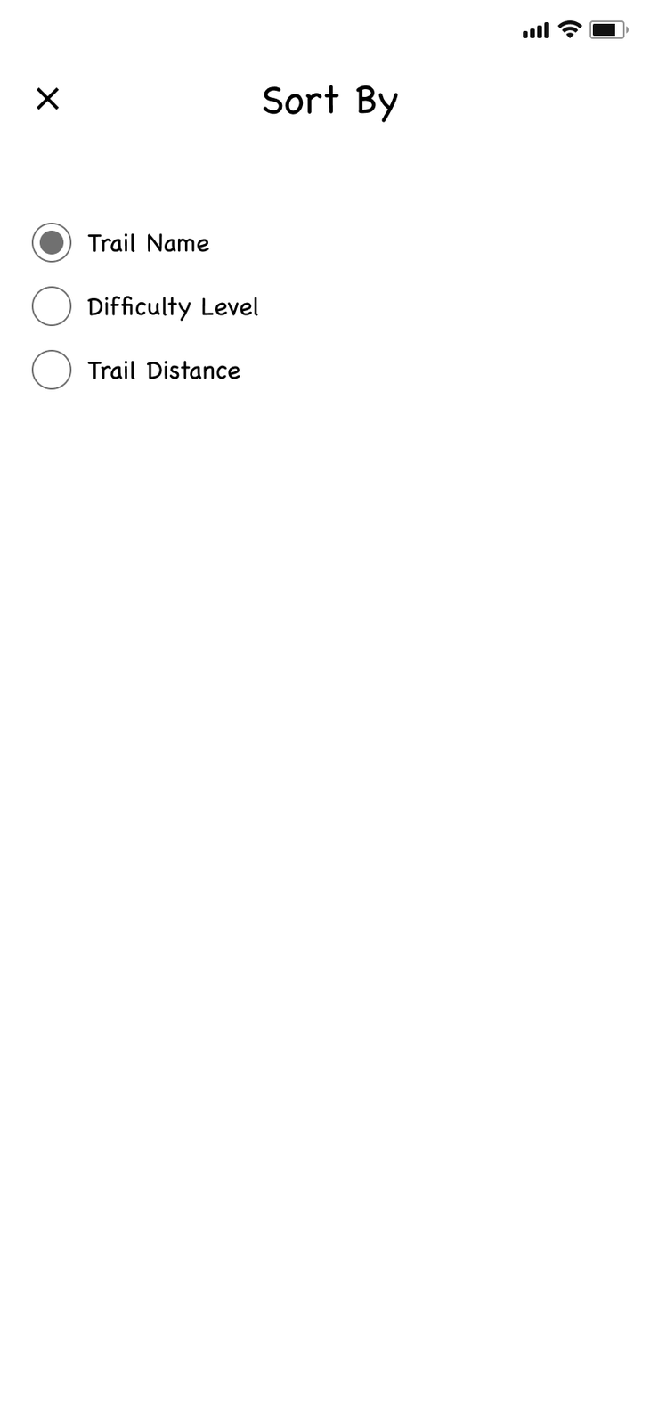
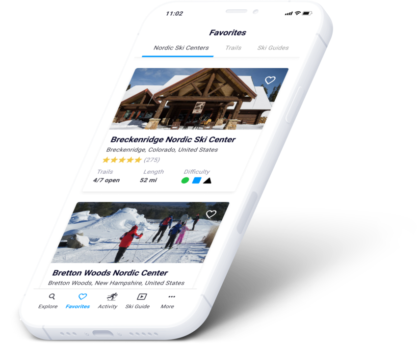
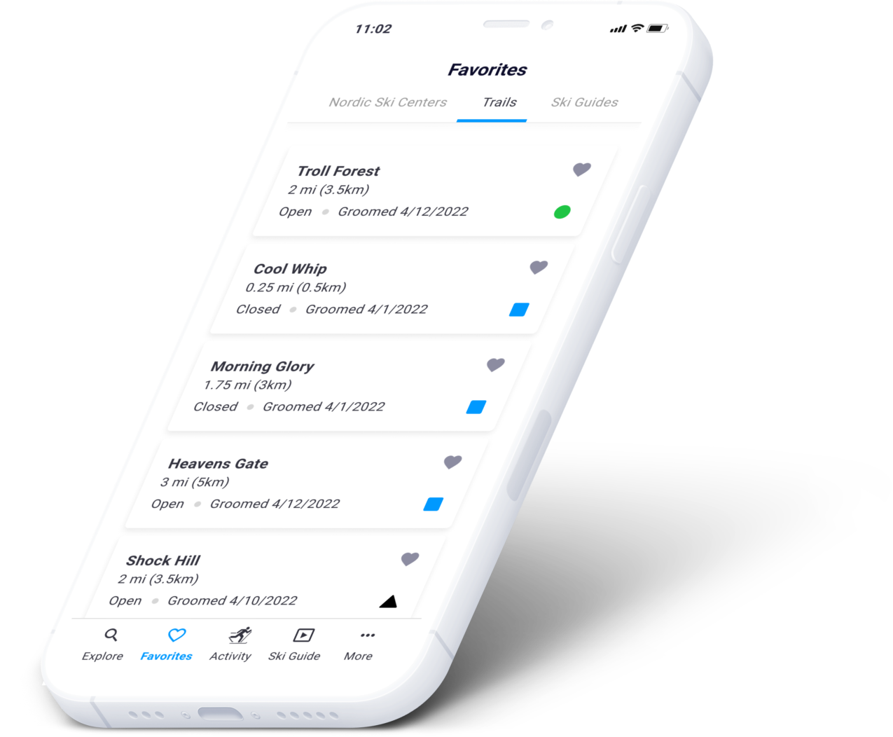
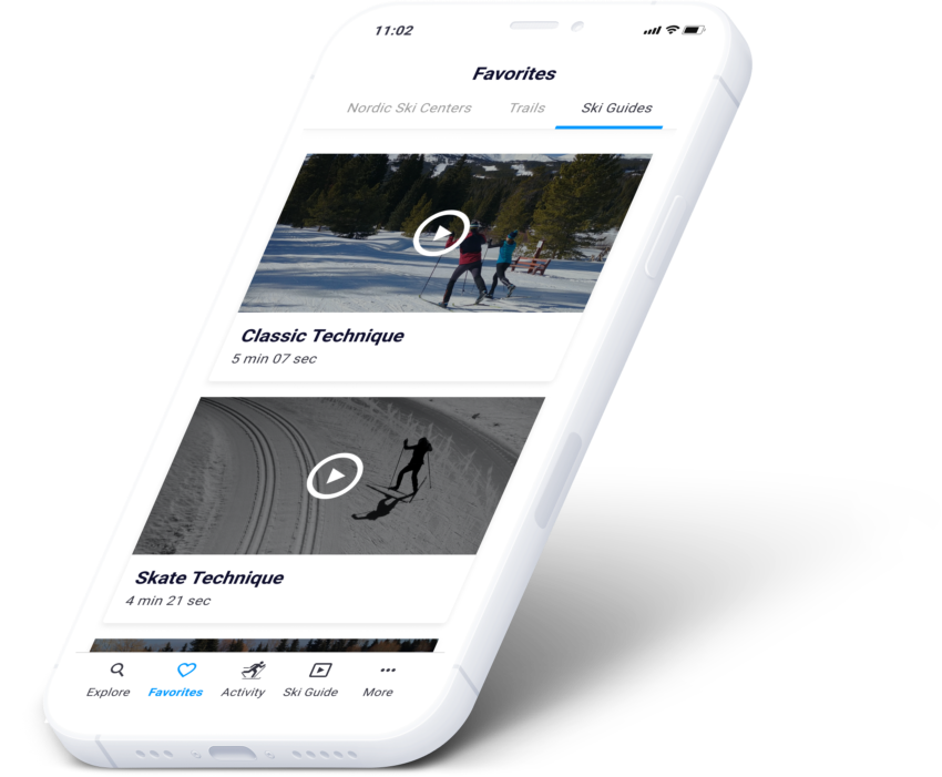
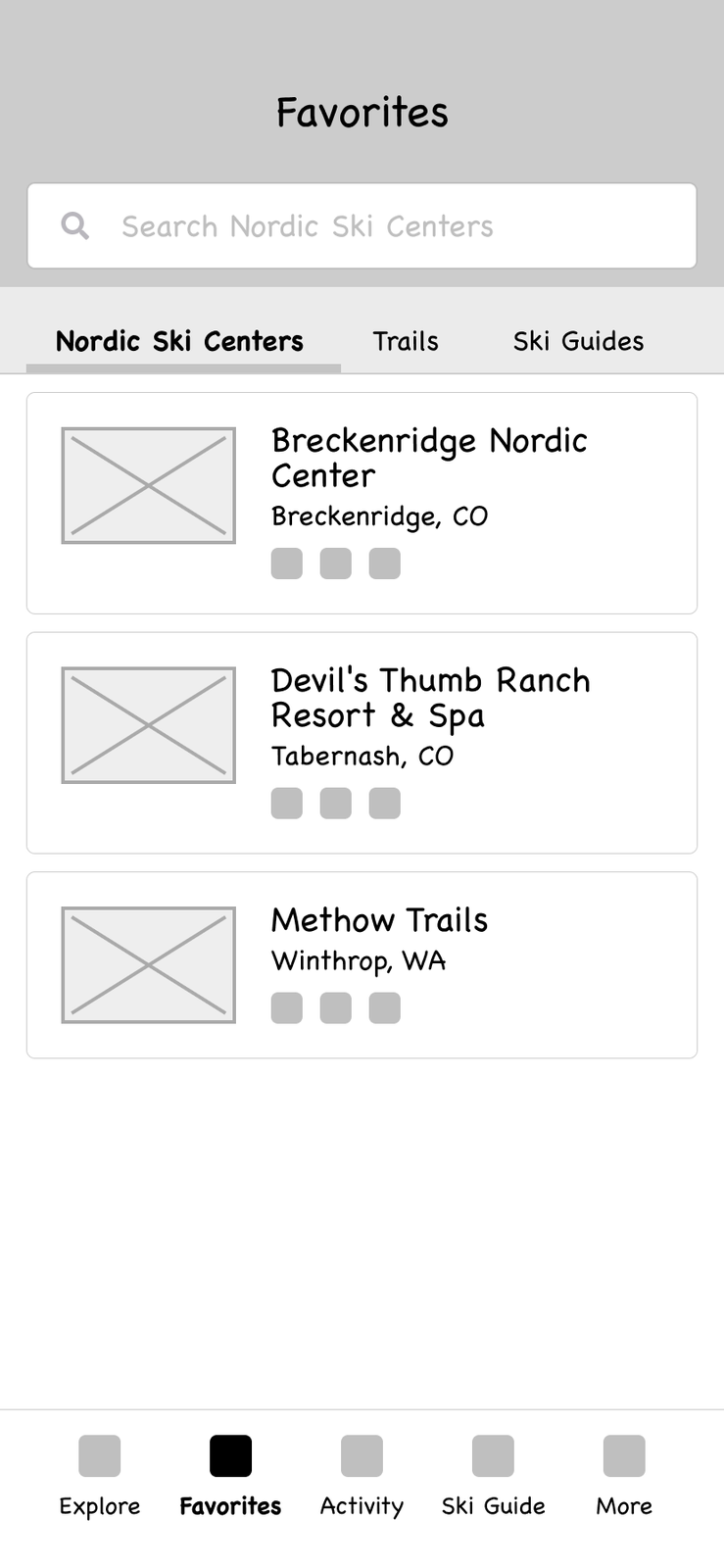
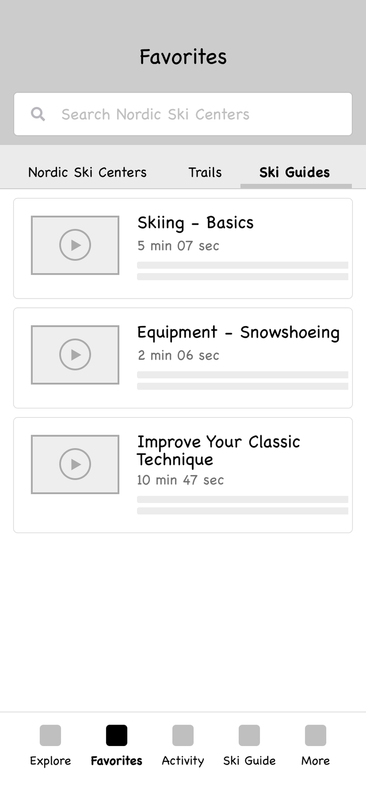
Quick access to the centers, trails and tutorials you keep coming back to.
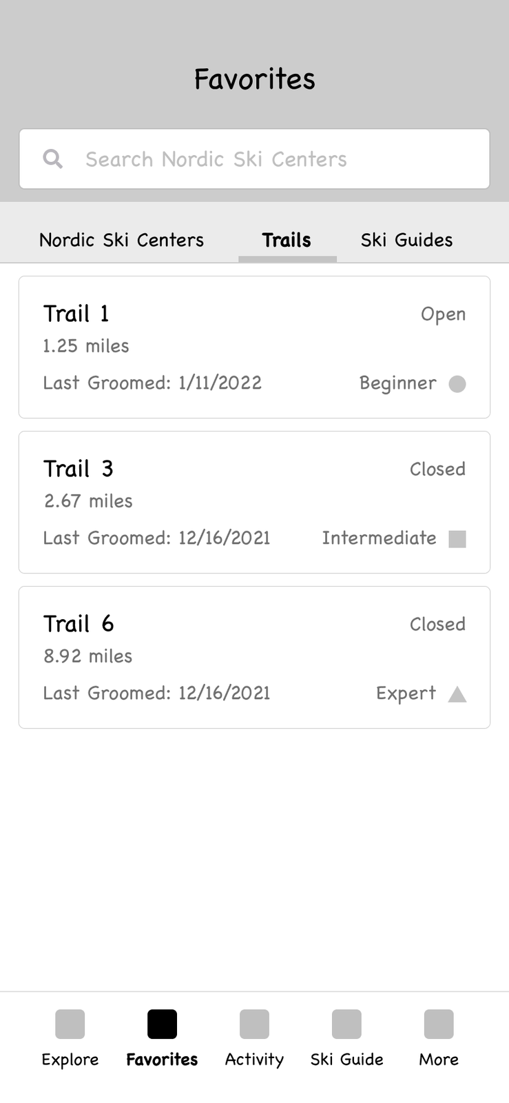
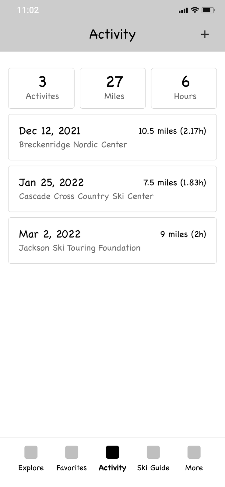
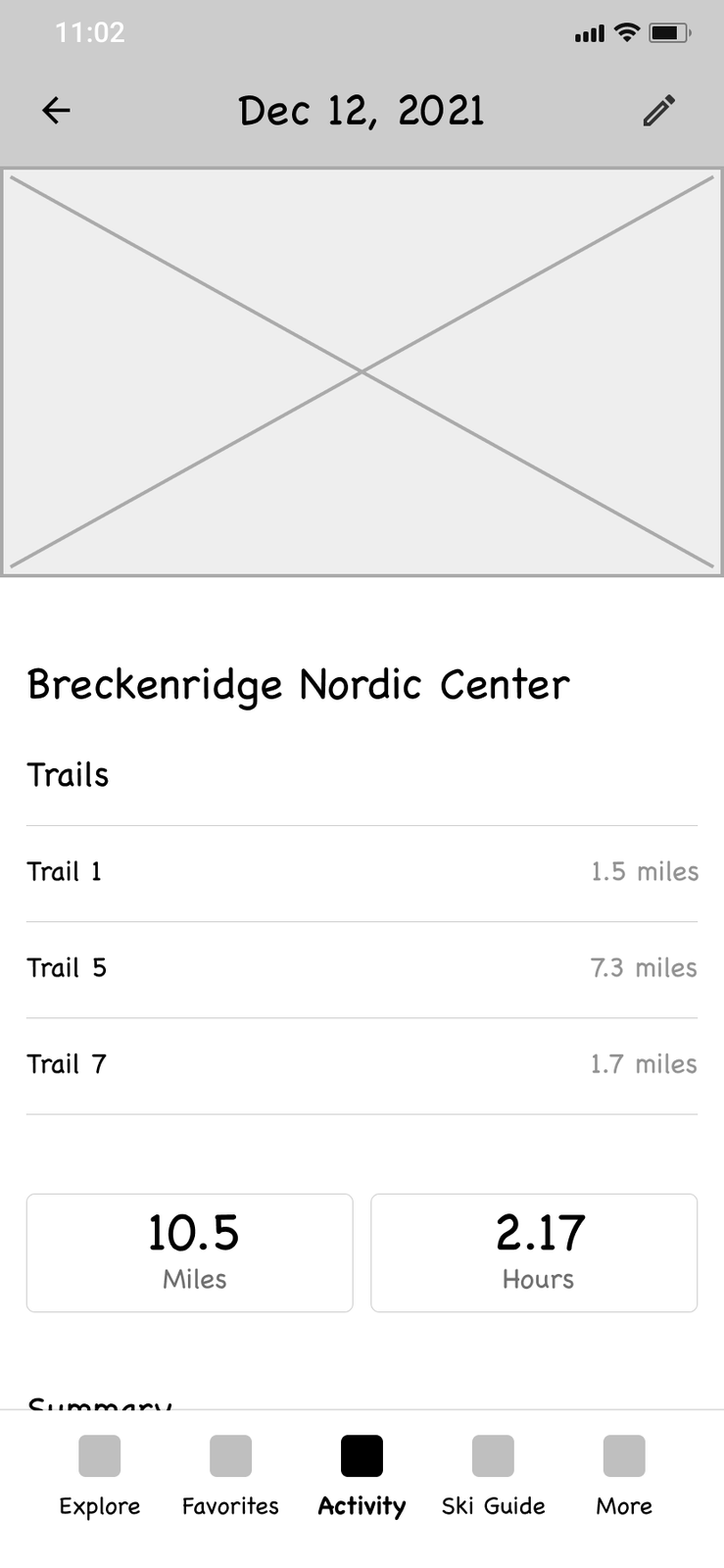
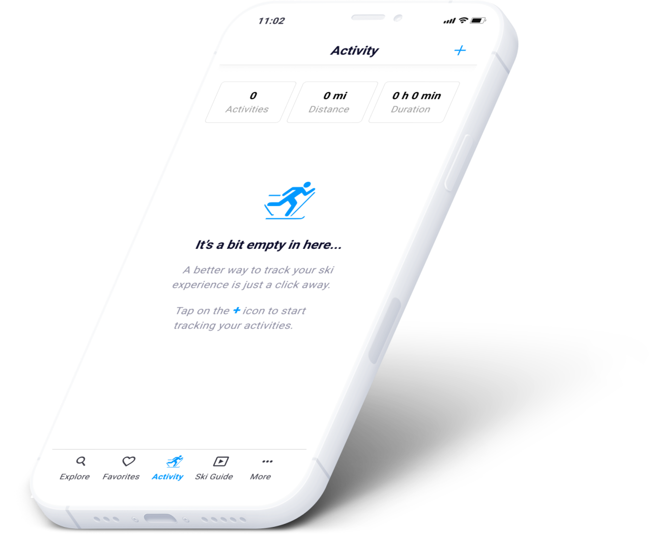
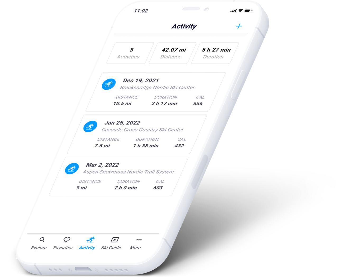
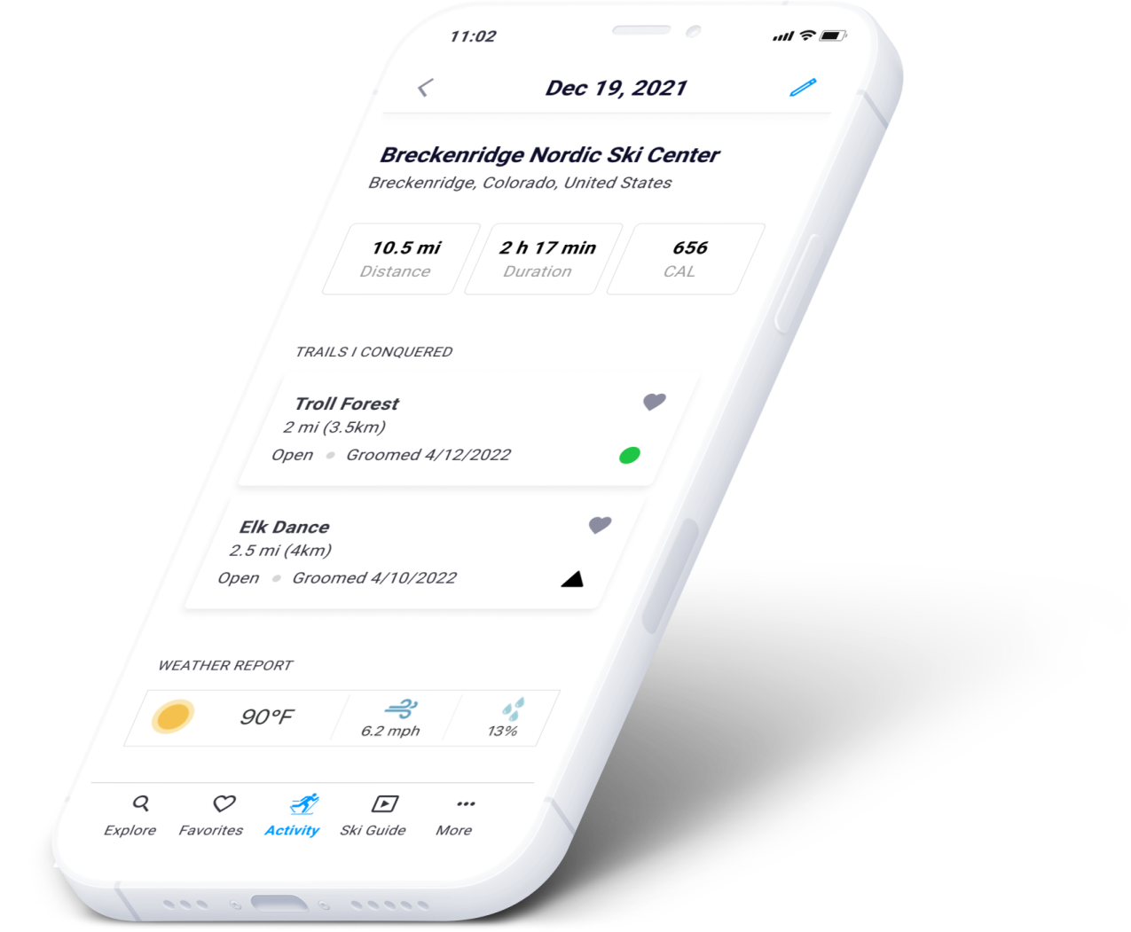
Tracking runs — with the trail detail the running apps never had.
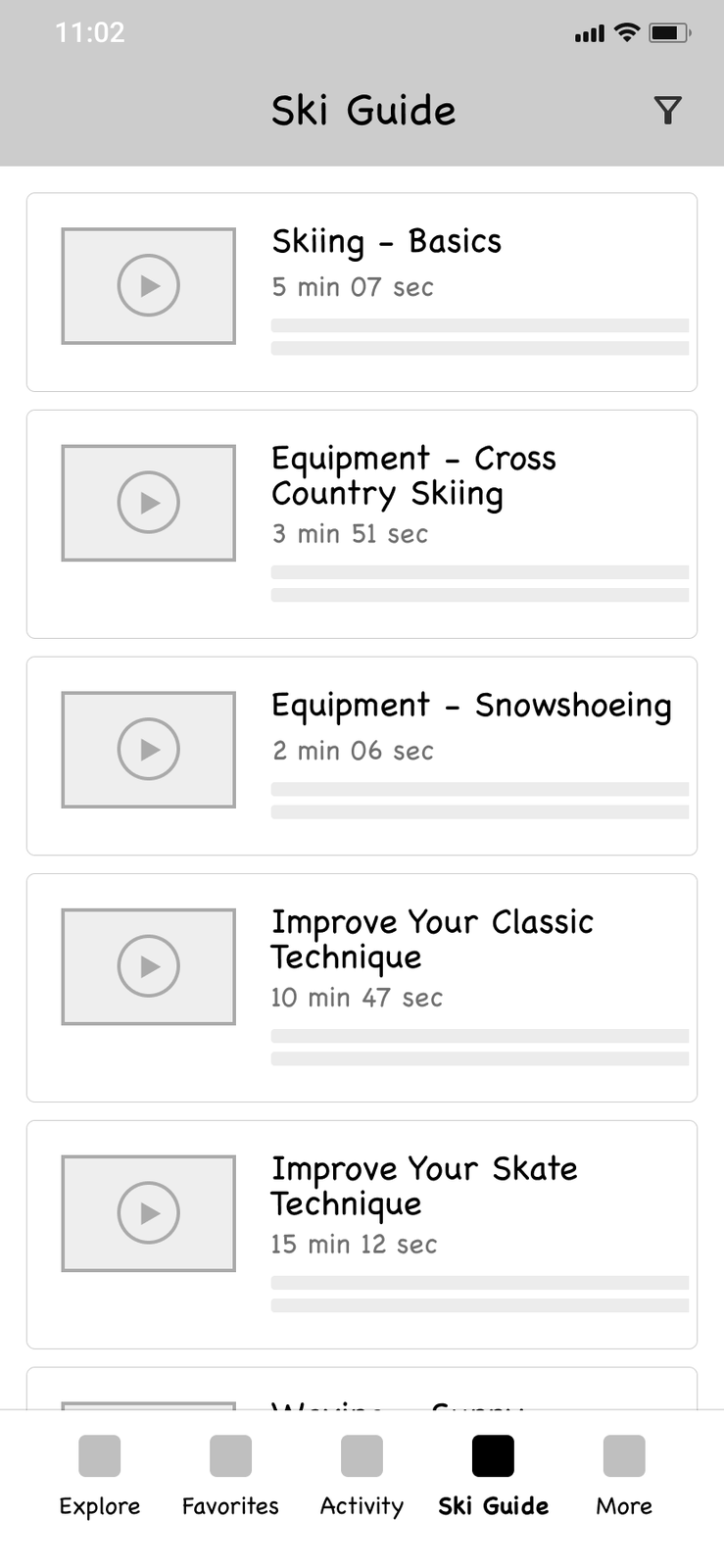
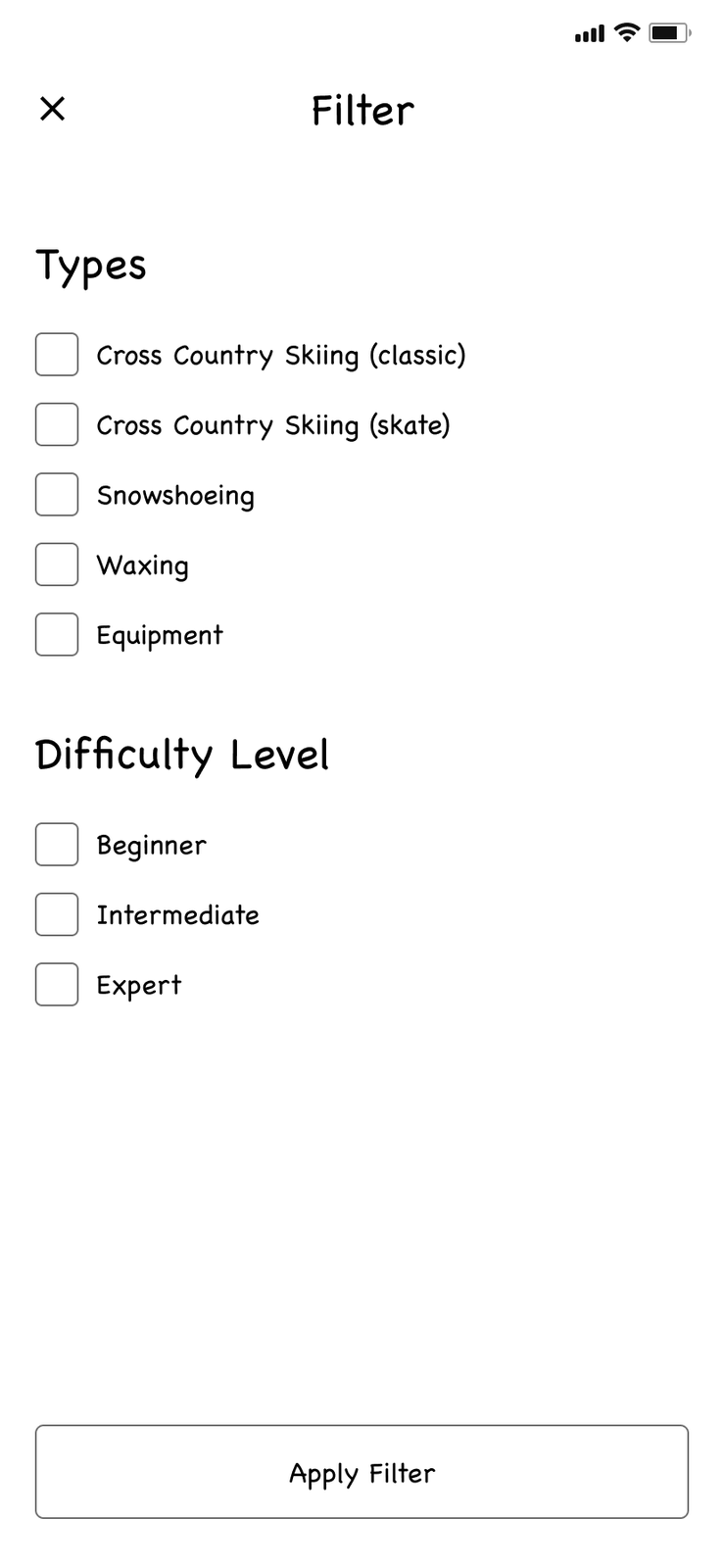
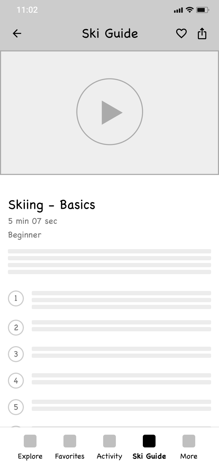
Technique videos, waxing instructions and tips.
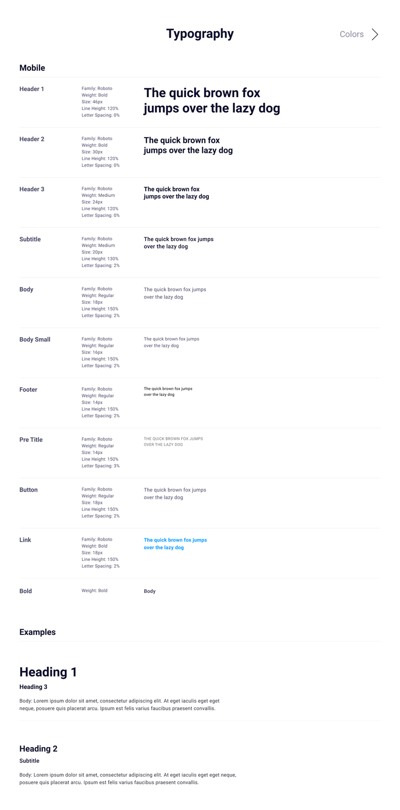
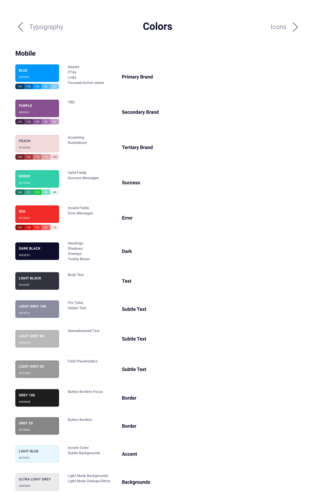
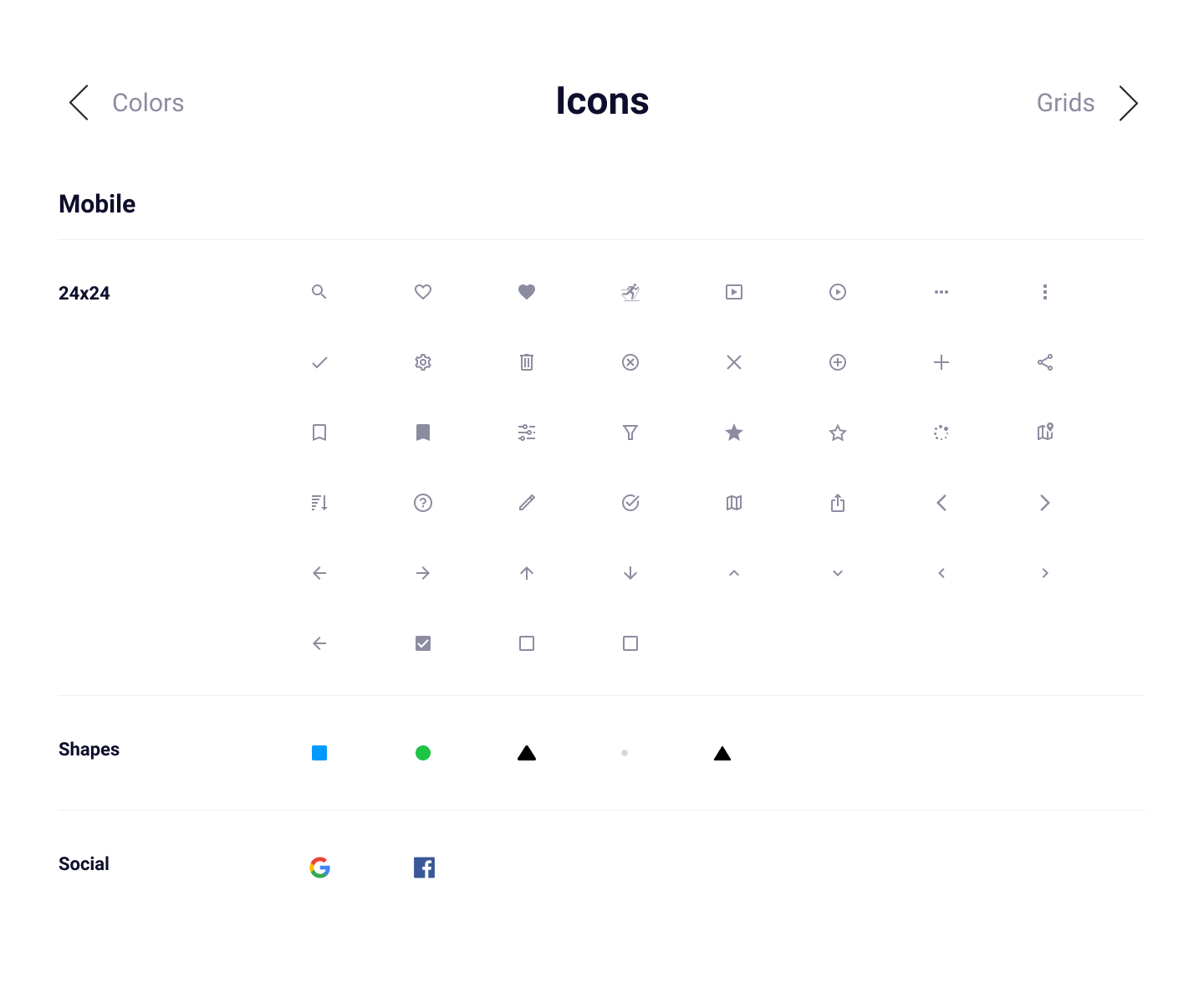
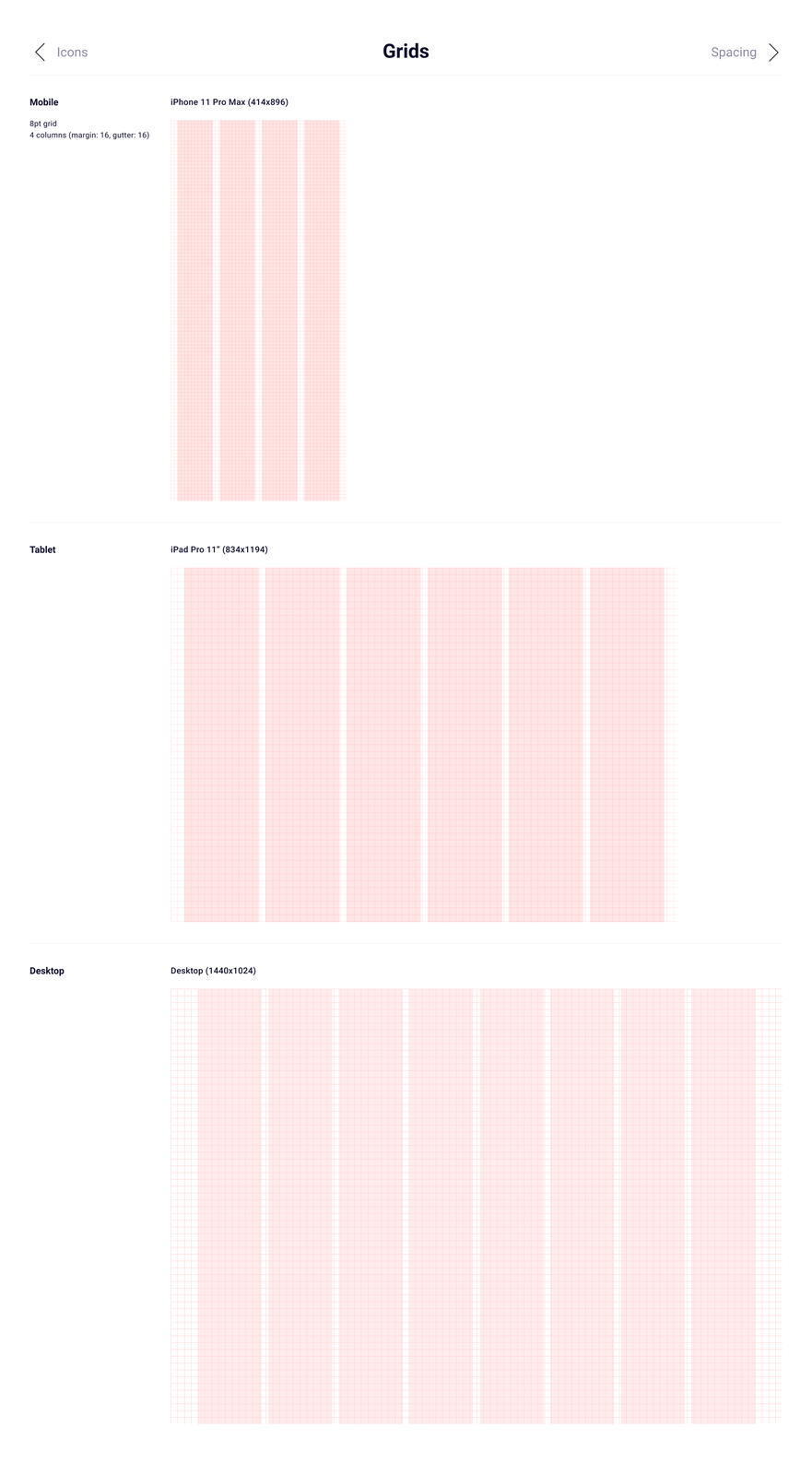
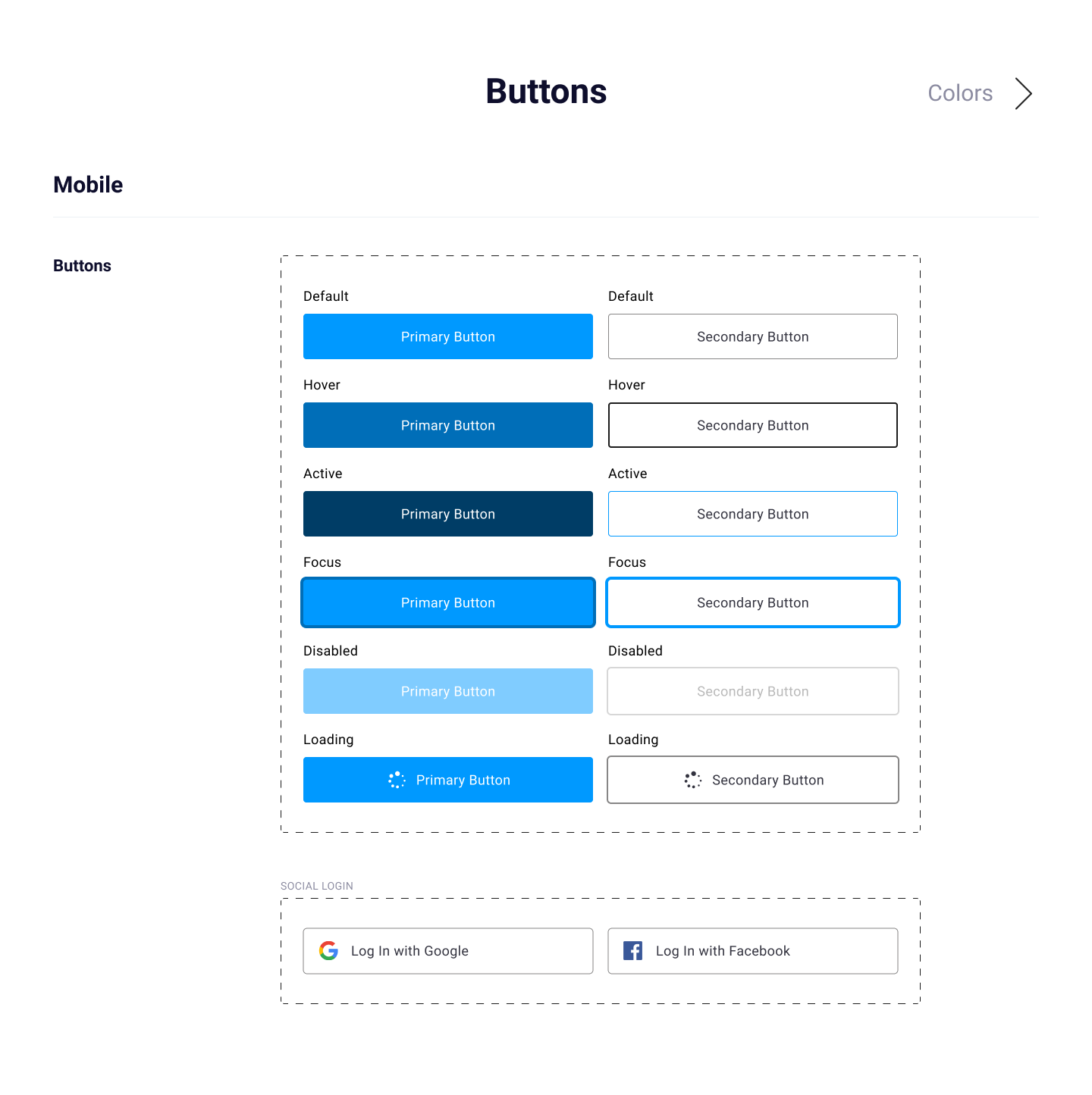
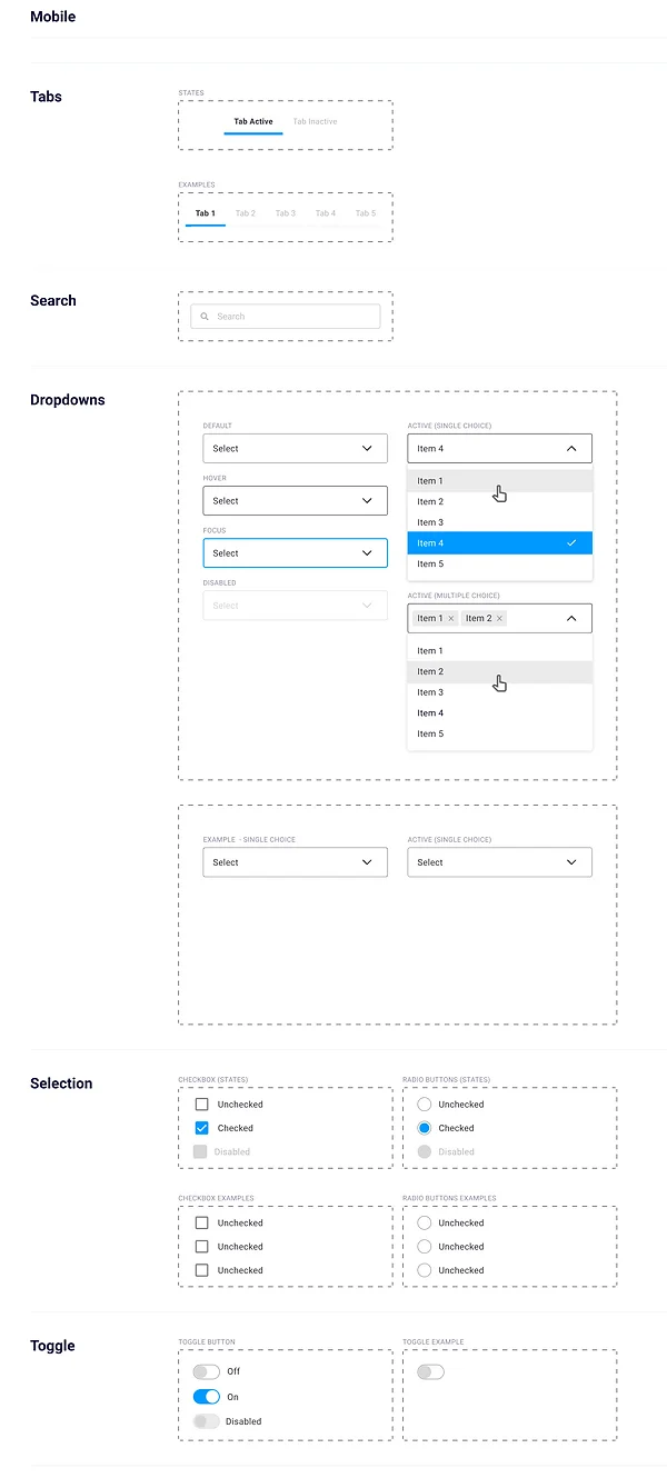
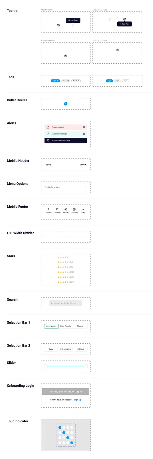
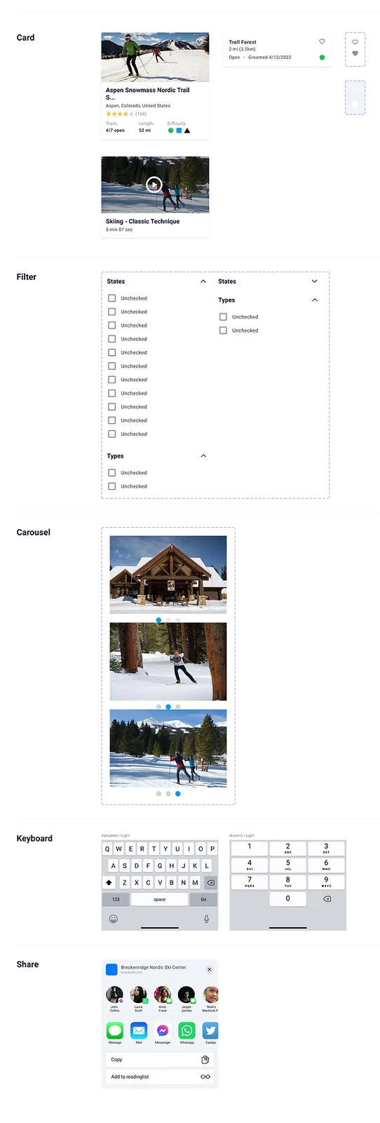
To keep the work moving I built a proper design system in Figma: a style guide of typography, colors, grids and icons, reusable components, and patterns where several components combine into something larger.
Components & patterns
Test plan · Two rounds · Results · Iterate
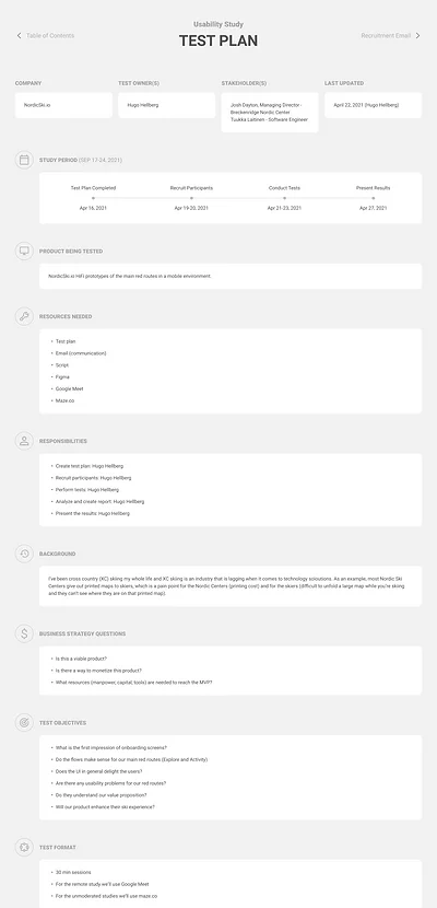
Two rounds of usability testing, five participants each. Per round: one in-person moderated, three remote moderated over Google Meet, one remote unmoderated in Maze. Thirty minutes a session.
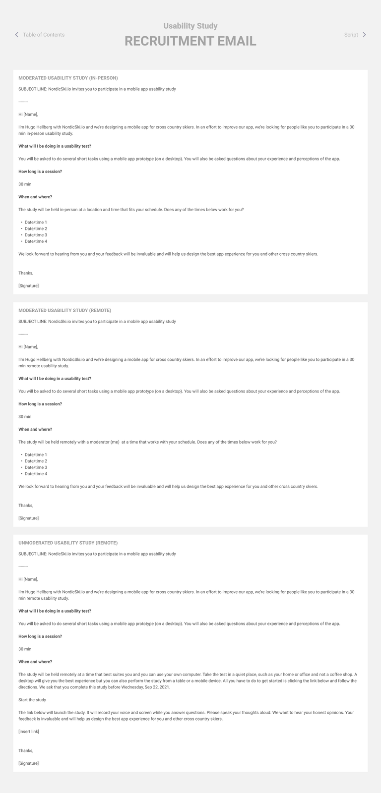
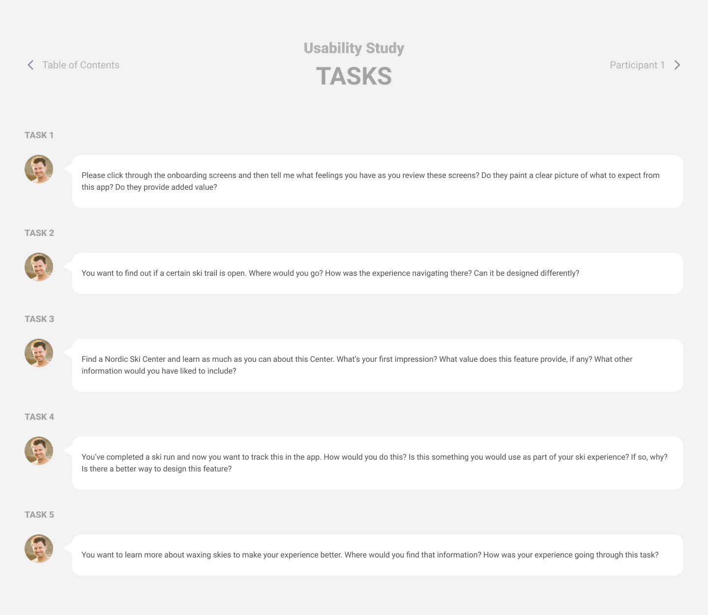
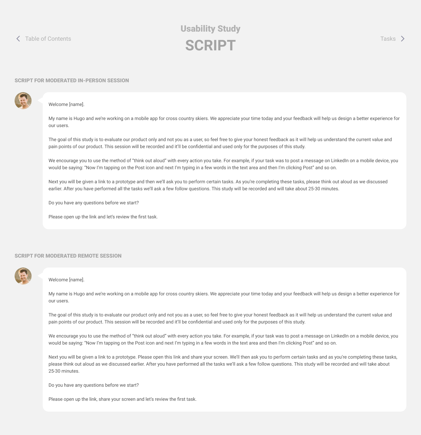
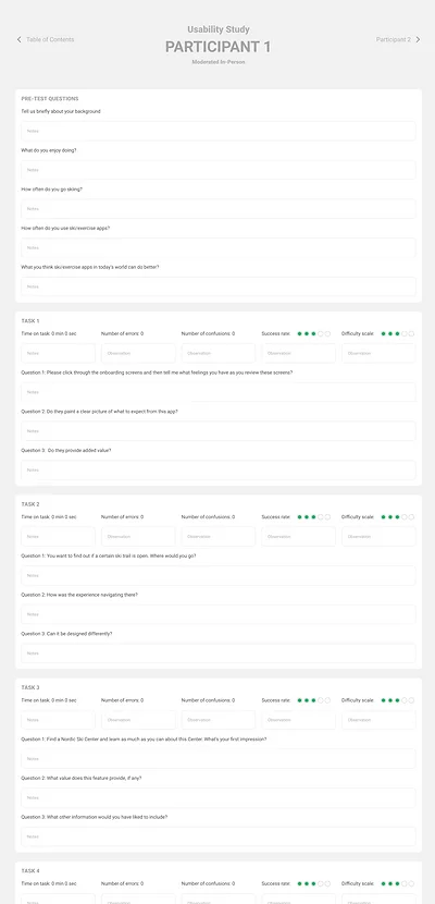
I built an extensive test plan template — recruitment emails, scripts, tasks, participant profiles. Snippets below.
The core flows worked
Finding a Nordic ski center or a trail was completed as expected by participants — the spine of the app held up.
People wanted the map sooner
Beyond the card view of ski centers, several users wanted map view immediately available, because it's faster for finding what's nearby.
Activity was too thin
For the MVP this module was basic, and testers doubted it offered enough to be worth using. Something to carry forward.
Wording, not layout
The UI drew positive comments for being easy to navigate. The friction was terminology — a few areas needed clearer words.
Which took us into a couple more rounds of iteration before the final design.
Onboarding · Explore · Favorites · Activity
After two rounds of testing and many iterations, this is where it landed. Let's be honest: design is never final. But for now, this is it.
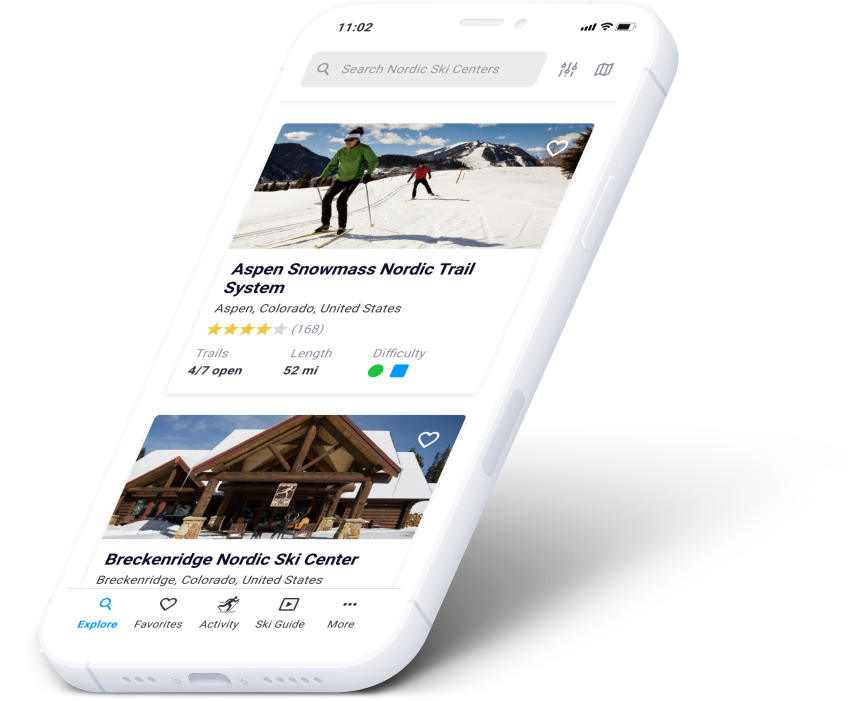
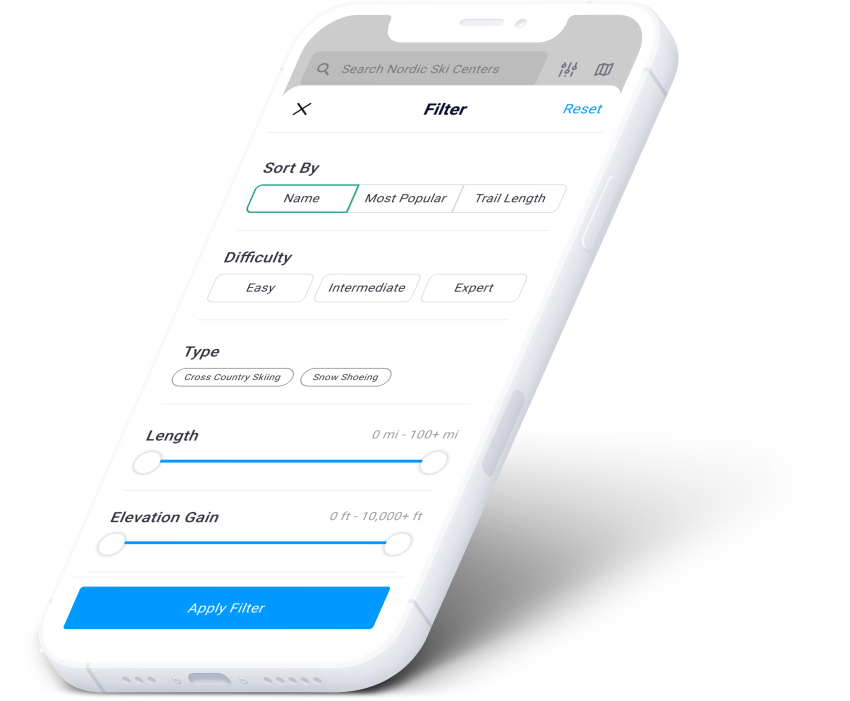
List view or map view of every center, with search and filters.
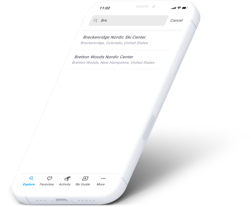
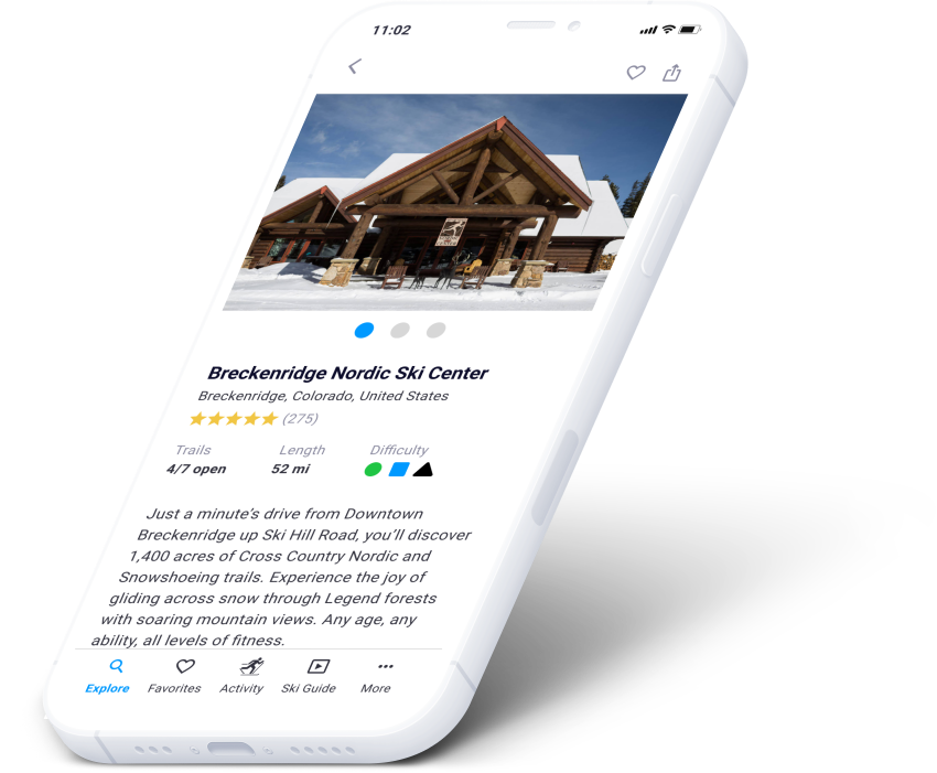
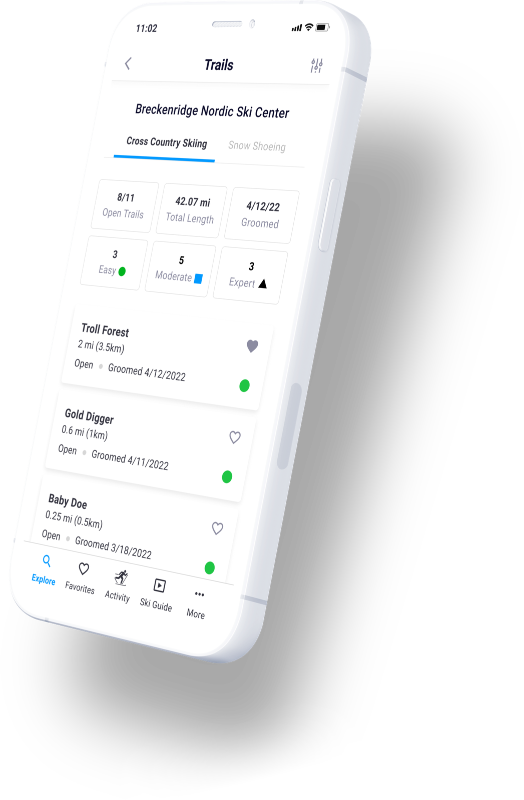
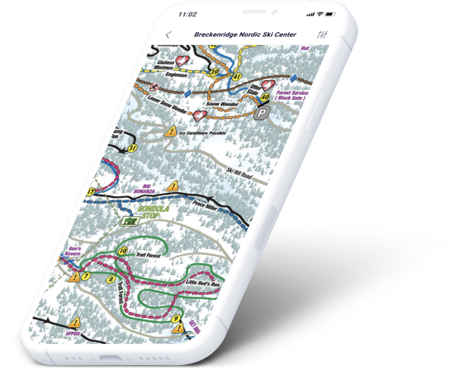
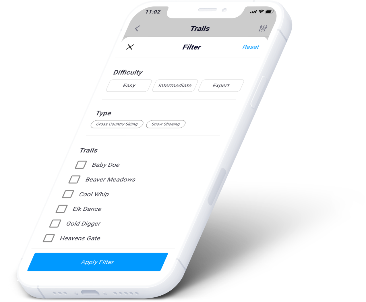
The same again for trails — the screen that replaces the printed map.
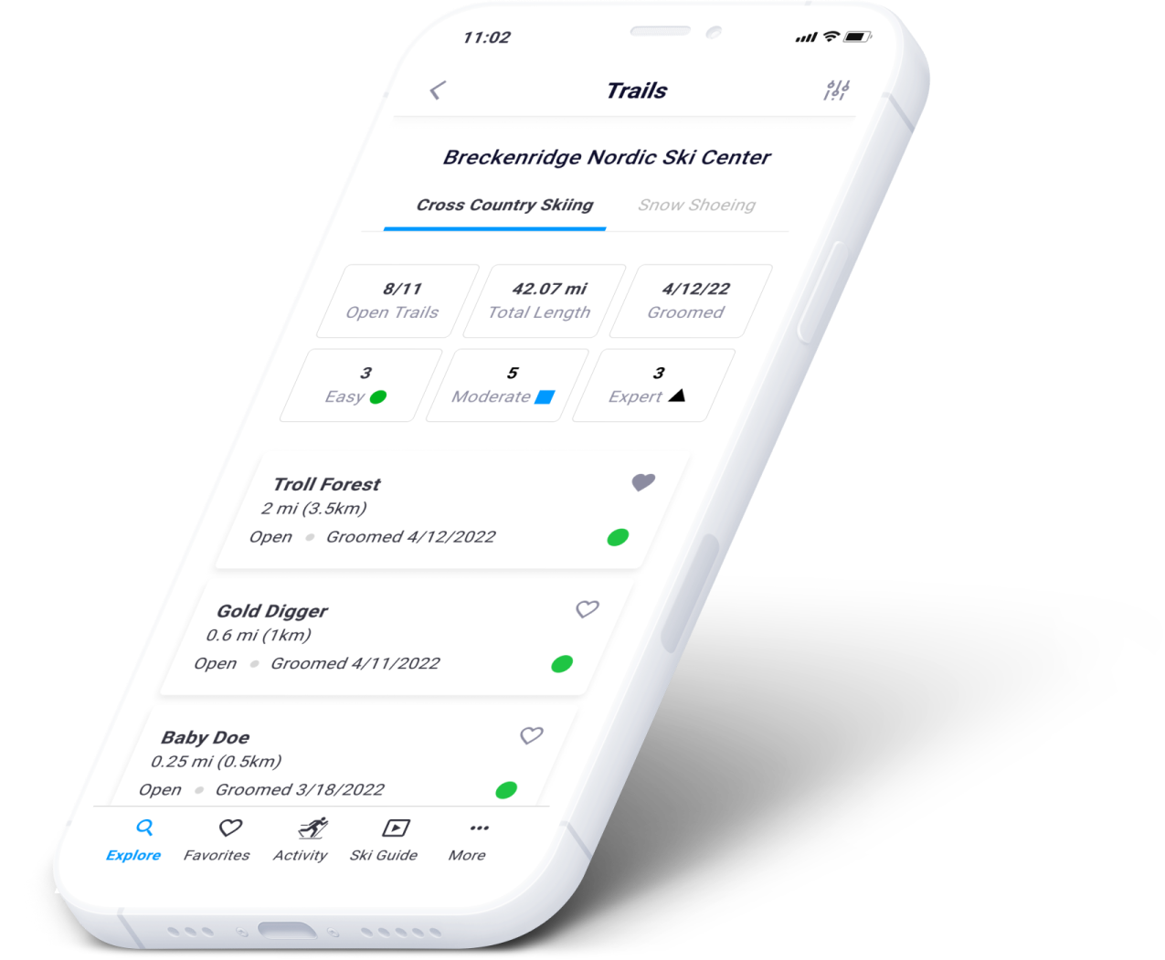
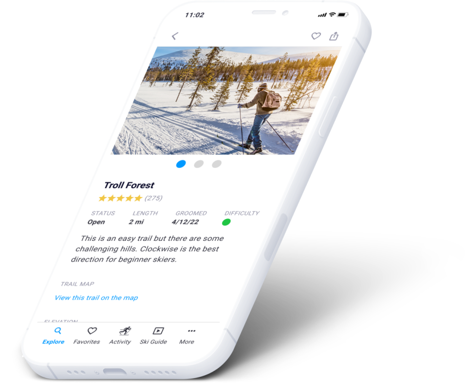
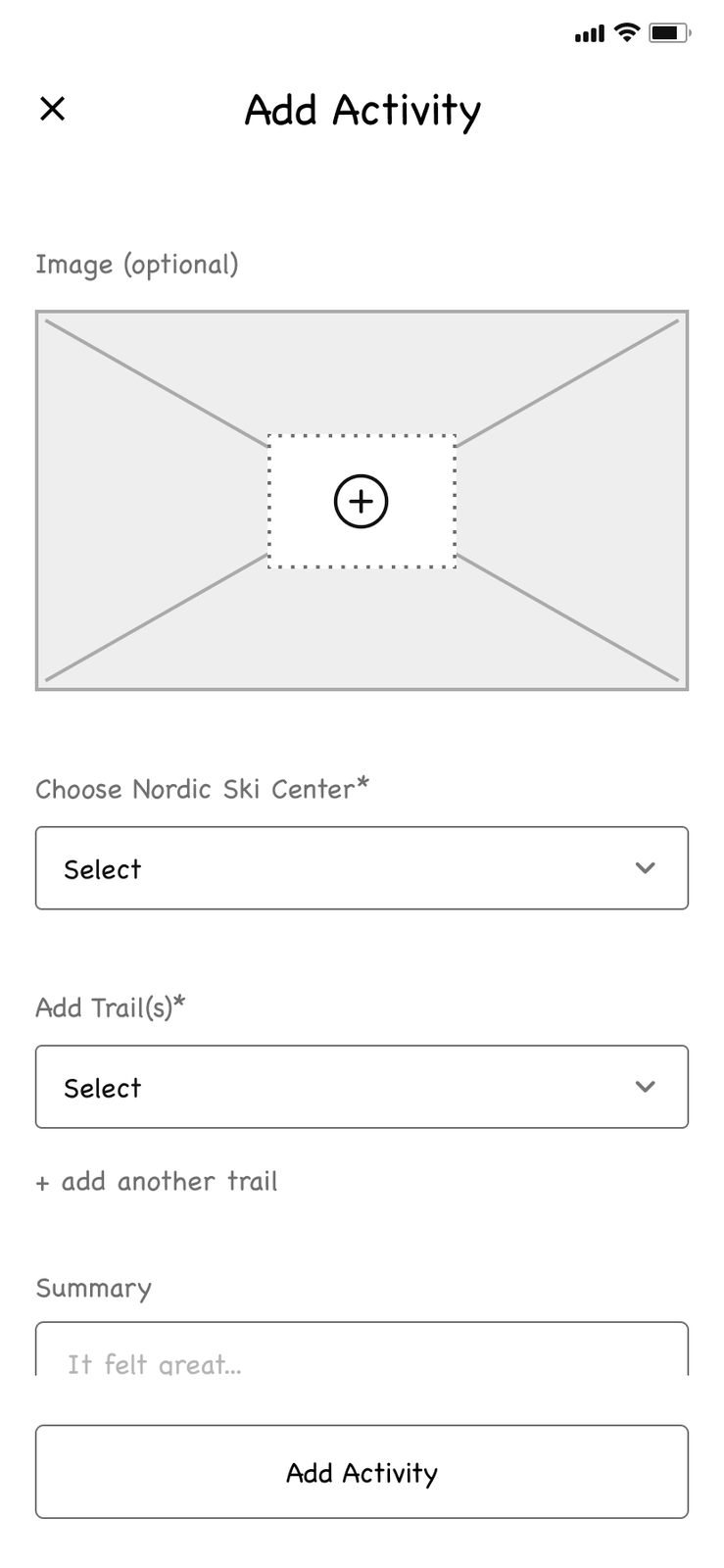
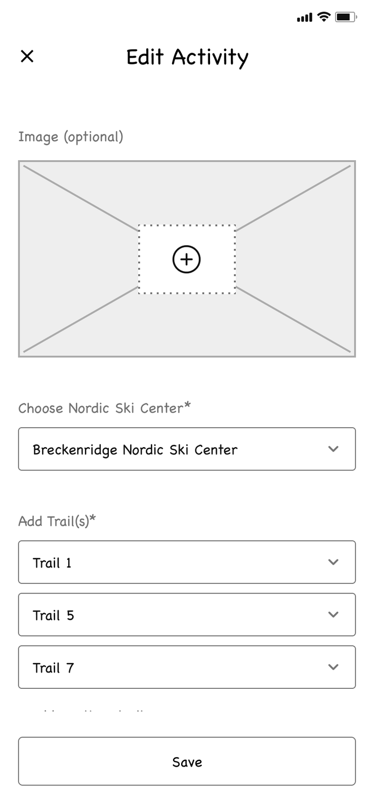
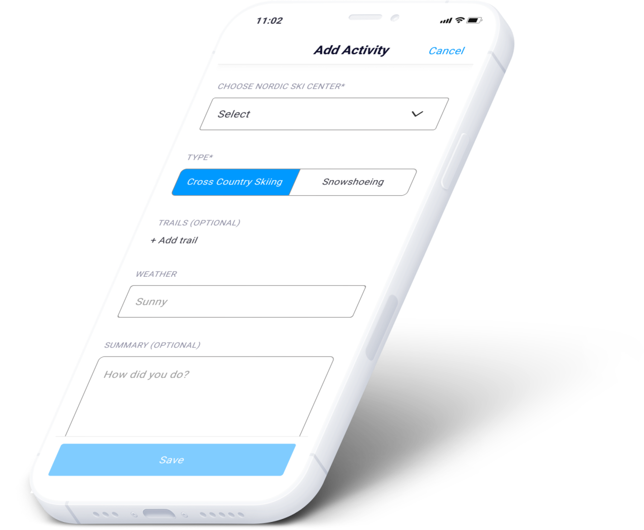
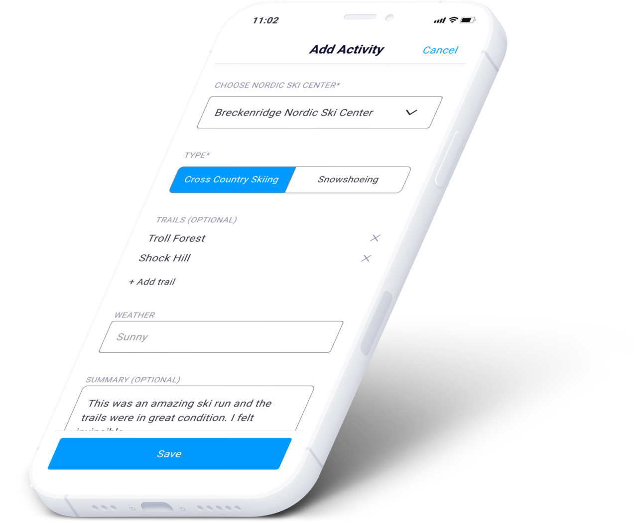
Add an activity with detailed trail information; distance adds itself up from the trails you ski.
Still open
Is it viable? · What shipped · Lessons learned
After a long journey we arrived at the final design, and the two rounds of usability testing gave very encouraging results. The overall feedback: this is an app a technologically neglected sport actually needs.
Replacing the printed maps handed out at Nordic ski centers was the single most wanted idea — seeing where you are via GPS, filtering trails on the map, and alerts shown right on it. Testers also liked the technique and waxing tutorials, to ski faster and more efficiently.
Overall this project gave me tremendous insight into UX research and the whole design process end to end. Designing NordicSki.io, I took on a deliberately empathic role: understanding how people behave and feel on a trail, and translating that into interface.
This was the traditional, long way round: desk research, a survey, interviews, affinity and empathy maps, personas, sketches, wireframes, a design system, two rounds of testing. I work faster now. But the thinking underneath hasn't changed.
What it taught me
Research is not a phase you get through. Every good decision in this app traces back to something a skier said out loud.
The final design is never final. This one is a snapshot between two rounds of testing and the next round of iteration.
Design for the sport, not the analogy. Cross-country skiers were being served by running apps — and the details are where the sport lives.